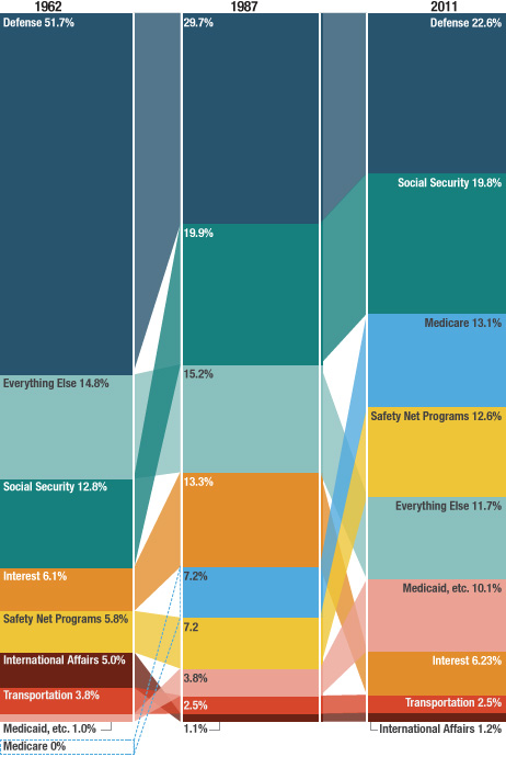
Of each dollar the federal government spends, how much goes to defense? How much goes to Social Security? How much goes to interest on the debt? And how has this sort of thing changed over time?
The graphic below answers these questions. It shows the major components of federal spending 50 years ago, 25 years ago, and last year.
Defense spending, while way down, remains the largest annual outlay. Social security and Medicaid are the big growers and are up significantly from 50 years ago.
50 Years Of Government Spending, In 1 Graph

Source:
50 Years Of Government Spending, In 1 Graph
Lam Thuy Vo
NPR, May 14, 2012
://www.npr.org/blogs/money/2012/05/14/152671813/50-years-of-government-spending-in-1-graph” target


What's been said:
Discussions found on the web: