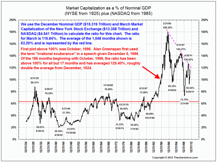
Ron Griess of The Chart Store was none too impressed with the post Are Stocks Ahead of the Economy?, especially, the WSJ chart we criticized.
He points out that “the data for the chart of GDP and market cap goes back a lot further than 1995. (Whether such a comparison is meaningful is another story).” At the very least, the short time period was questionable given the rich data history available.
Ron is the conscience of chart watchers everywhere, and his advice is “If you are going to show GDP and Market Cap, a ratio chart is much better than the chart referenced from the WSJ.”
And of course, he has one handy:


What's been said:
Discussions found on the web: