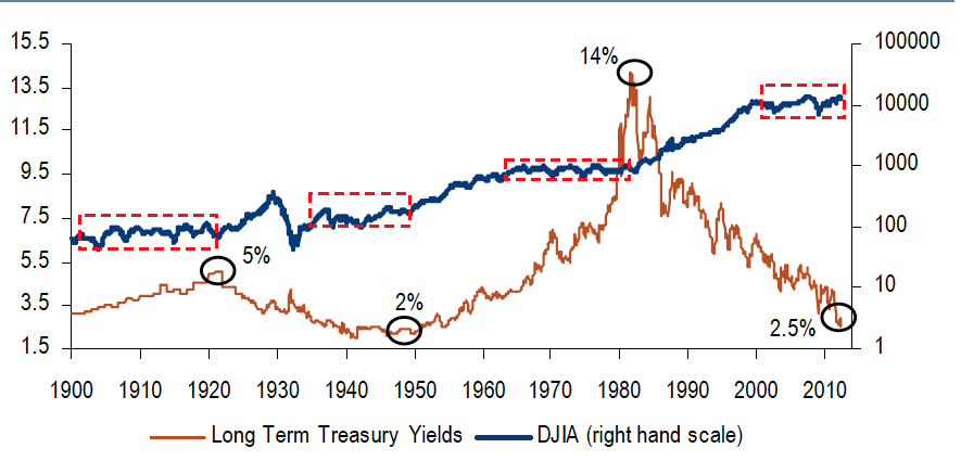
Equity prices & bond yields since 1900

I don’t often give props to big Sell Side firms, but today I must make an exception. Merrill Lynch’s Equity Strategy group put out The Longest Pictures: Picture Guide to Financial Markets Since 1800 this week. Its a 102 page doozy looking at every asset class and country going back through the history of time. It illustrates a variety of long-run trends in financial markets.
The chart above shows equities in their 4th secular trading range — aka Bear market — while bonds are enjoying their 2nd great secular bull market of the past 110 years.
I am in concurrence with this perspective:
“We nonetheless remain of the view that the catalyst for a decisive change in secular market leadership (or “Great Rotation”) awaits a “good” bear market in bonds caused by real estate, labor and banking markets ending the current Era of Deleveraging.”
In other words, until this secular bear market ends — perhaps with the Bond market cracking — expect contained equity markets and modest returns.
I cannot give out their copyrighted work, but you should definitely get your hand on this if you can (surely you know someone who works at BofA/Merrill?).
Nicely done.
Source:
The Longest Pictures
Michael Hartnett, Chief Global Equity Strategist
BofA Merrill Lynch 27 June 2012


What's been said:
Discussions found on the web: