Real Time Economics – Number of the Week: Corporations Not Hoarding Cash
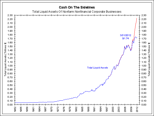
$496.5 Billion:How much less cash U.S. corporations had at year-end 2011 than previously believed. The Federal Reserve on Thursday came out with its quarterly “flow of funds” report, which for two years now has reflected the steady increase in the amount of cash on corporate balance sheets. Sure enough, the report showed that corporate cash ticked up yet again in the first quarter of the year by around $12.6 billion, to $1.74 trillion. … In other words, the big pile of cash sitting idly on the sidelines? “Boom, it’s all gone now,” says James Bianco of Bianco Research. Mr. Bianco has long been skeptical of the cash-hoard narrative. Even before the revision, he argued that the rise and fall of the real estate bubble distorted the corporate cash picture, making cash look artificially small as a share of assets when property values were rising, and then artificially large when prices collapsed. Better, Mr. Bianco argues, to strip out real estate and look at cash as a share of financial assets, which showed a much milder run-up in cash holdings using the old data, and now shows no run-up at all. “It was slightly above average and now it’s not even that anymore,” Mr. Bianco says.
Comment
Click to enlarge:
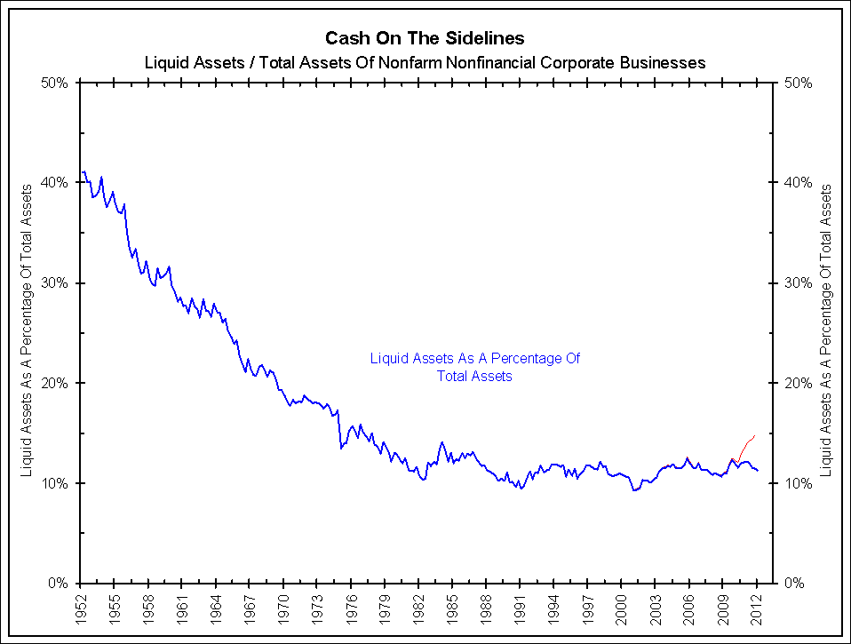
Liquid assets held on companies’ balance sheets is a nominal number, much like the nominal level of GDP, that rarely decreases. This series must be compared to other balance sheet items for relevance. The chart below shows liquid assets as a percentage of total nonfarm nonfinancial corporate business assets since 1952. By this measure, the “cash on the sidelines” argument is far less compelling (blue line), especially after revisions (red line).
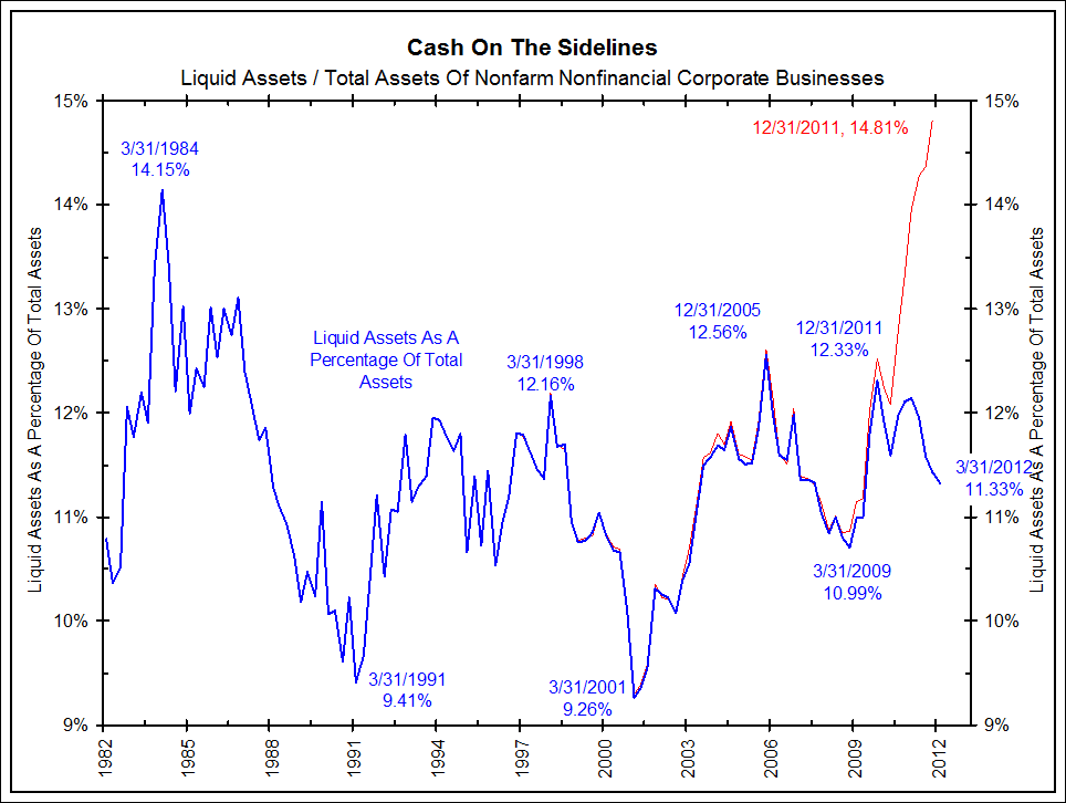
When examined over a shorter time frame, as shown below (same chart as above, shorter time frame), the percentage of cash on the sidelines was revised from the upper end of its range of the past 30 years to the middle.
We have argued in the past that the potential of excess cash on the sidelines to help buoy the markets once invested was minimal. After considering the latest revisions, this becomes even more true.
For an updated look at all of our charts from the Federal Reserve’s Q1 2012 flow of funds report click here.
Source: Bianco Research


What's been said:
Discussions found on the web: