Over the years, debate has waxed and waned over the effects of the minimum wage and/or immigration policy on employment, particularly teen/youth employment. When the issue flared up most recently, a couple of years ago, I posted a rebuttal to that argument here, my point being that it was – at least this time around – crappy demographics and a lousy economy that had older workers staying in – and re-entering the labor market to seek – jobs far longer than we’d seen previously:
What about demographics — an aging boomer population — and a crappy economy that has the 55+ cohort postponing retirement and consequently crowding out the younger generation (parents keeping their own kids/grandkids out of the job market, as I put it a while back). The data is there for all who choose to explore it.
A short while after that post appeared, BR got a request to reprint from the folks at Cengage Learning/Greenhaven Press, who asked if they could include the article in their academic Opposing Viewpoints series of books. I obviously consented to allow the piece to be reprinted, and the book was recently published (specific URL for the volume on Minimum Wage is here). I’m flattered that I’ve now had a piece published, a first for a me. I’m also very appreciative to BR – as he well knows – for his willingness to give me a little corner of his soapbox, and hope I provide some value-add to TBP readers. (My stipend for the piece went to a local humane society.)
That said, why not revisit the issue of youth employment and see where we now stand?
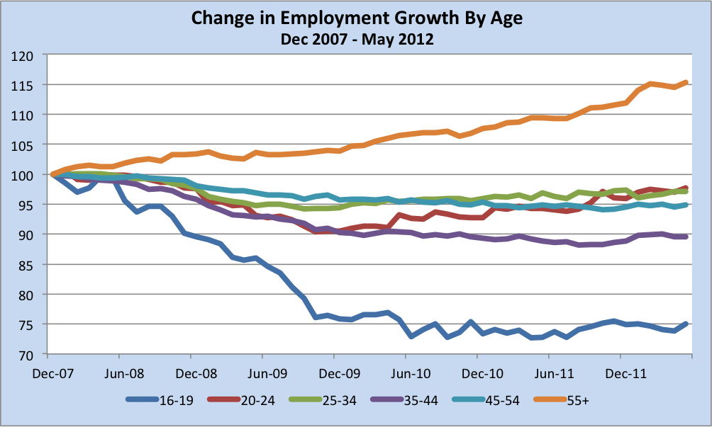
Here is how employment growth (or lack thereof) has evolved, by age cohort, since the beginning of the Great Recession:
(Source: St. Louis FRED, Series LNS12000012, LNS12000036, LNS12000089, LNS12000091, LNS12000093, LNS1202423)
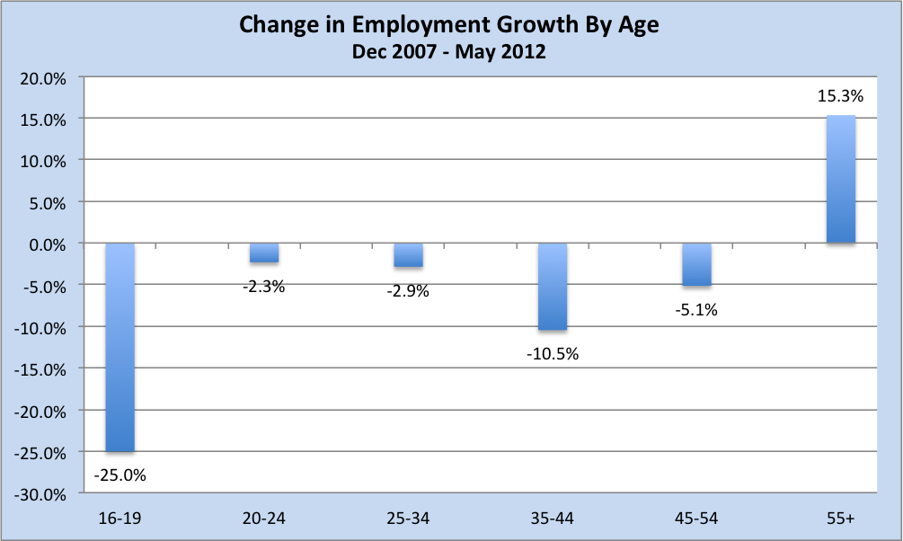
And here’s a different look at the exact same data, an update of the chart I ran two years ago:
Very coincidentally, as I was working on this post, David Rosenberg commented on this very topic, including a variant of the chart immediately above. Rosie’s take on the situation (Breakfast with Dave, May 29, 2012):
Even if some of us dream about becoming a paid consultant in our golden years, the reality is the re-entry of boomers into the workforce is a case of having to, not wanting to. It is what is essential to retire with dignity, not some desirable lifestyle change. Employment for those 55 and up have risen to new all-time highs this cycle while everyone else is languishing nine million below the 2007 peak. […] There are a few side effects from the bulge in employment for the 55-and-up segment of the population. One is that by not leaving the workforce as they have done in the past – going for early retirement – they have created a backlog of unemployment among the youth.
Precisely. With the benefit now of some hindsight – I made my original argument in real-time – I think it’s clear that it has been, in fact, demographics and a crappy economy that accounts, for the most part, for our youth unemployment problems. (Finally on this topic, Rosie notes that the older cohort “has not seen an erosion in its participation rate or in its employment-to-population ratios.”)
Shifting gears now to make sure I cover as much of the waterfront as I can, several unrelated tidbits:
I wish I had authored this brilliant piece by Mark Dow, which really resonated with me. As the old saying goes, “If the only tool you’ve got is a hammer…” Mr. Dow’s piece is spot-on in every regard.
With interest rates in many parts of the world hitting all-time record lows, I’d be remiss if I didn’t give a shout-out to the inflation hawks of the past few years. To those who foretold a spike in interest rates and hyper-inflation – Jerry Bowyer, Arthur Laffer, the Wall St. Journal, et. al., – here’s to you. An object lesson in putting ideology over analysis. (As an aside on bonds, rates, equities…well…this.)
There appears to be some tin foil hat commentary, to which I won’t link, to the effect that DOL is cooking the books because the weekly Unemployment Insurance Claims revisions are almost always higher in the hope of making the Obama economy look better than it is. The thinking appears to be:
- A better (lower) number is presented initially, then subsequently revised higher (in the dark of night) when no one is watching.
- If an initial 380K is followed by a subsequent 390K while the 380K is revised to, say, 395K, the latest 390K print looks like a decline (off the revised number).
- As one tin-hatter writes: “It’s getting ever more difficult to accept DOL’s ongoing underestimations, which now run to 60 of the 61 most recent weeks I’ve been able to track.”
A few comments:
- The string of almost-exclusively-up revisions dates back quite some time, and most certainly to the previous administration. So the DOL clearly must have been fudging for him, too.
- It’s a virtual certainty that the DOL does not massage the UI numbers for one simple reason: they don’t even produce the UI numbers. All they do is act as an aggregator for 53 areas (50 states plus D.C., Puerto Rico and Virgin Islands) that electronically submit their data twice weekly (an initial pass followed by a revision). Anyone who wants to could check the 53 separate inputs vs what the DOL reports out; they should sum to what the DOL releases. [NOTE: This would actually require doing a bit of legwork.]
- There are myriad reasons for the revisions, and almost all of them lead to a higher revised number. This was explained to me in painstaking detail by one of the folks running the program on a lengthy phone call that none of the conspiracy theorists apparently ever felt like making. Why get the facts when you can spread a rumor?
- In any event, the revisions are typically less than 1% up or down (look to be around 2,500 or so on around 370,000, or 0.7%), which should be acceptable to most.
- It’s likely the DOL will issue some explanatory commentary on the matter in the weeks to come. Hopefully that will put this idiocy to rest, but I won’t hold my breath on that front.
Finally, I highly recommend to all It’s Even Worse Than It Looks by Thomas Mann & Norman Ornstein, two long-time congressional scholars, on the roots and current status of our calamitous dysfunction in Washington. See their April WaPo op-ed piece here. You may not have heard of their new book because, sadly, as Greg Sargent points out, the duo are being totally ignored by the Sunday talk shows.
@TBPInvictus


What's been said:
Discussions found on the web: