Here’s a couple fugly charts from the major equity indices that we track. The ugliest are China related such as its de facto suppliers — Japan, Korea, and Brazil.
Let’s start with S&P500 – a relatively good looking chart – for a comparison. The index has been zigzagging off its short-term uptrend line making higher highs and higher lows since bottoming in June. It feels the world wants large cap U.S. stocks and this is where the global allocation is taking place. Currently at uptrend support the S&P needs to hold the 50-day at 1333, which it did today bouncing off 1337. A close below 1325 “breaks the mirror.”
 The Russell 2000 broke its uptrend and made a lower low today. Though it closed above the 50-day, we now view this chart as damaged goods. Note the Russell is a fave hedging vehicle of the fast money crowd betting on an economic slowdown.
 The CAC 40 looks like a classic double top. ‘Nuff said.
 The Nikkei broke the neckline of its head and shoulders formation and a test of the June 4th 8230 low looks to be in the works.
 The Kospi needs to hold support at 1774 or a test of last September’s low of 1644 is likely.
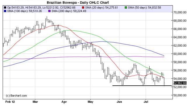
 The Brazilian BOVESPA is the worst YTD performer on our watch list. The index made a new 2012 low today. Let’s see if the BOVESPA can bounce on the stronger than expected PMI data from China.
 The Shanghai Composite wins the ugly chart contest. The index is down almost 40 percent from its August 2009 post-crash peak and remains in an ugly downtrend. A break of the January 2012 low of 2132 could get ugly.
 (click here if charts are not observable)


What's been said:
Discussions found on the web: