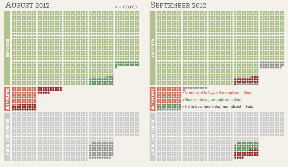
Fascinating chart from the WSJ’s Real Time Economics, depicting the monthly change in payroll. You can scroll back 30 years to 1992:
click for larger chart

Source: Real Time Economics
Fascinating chart from the WSJ’s Real Time Economics, depicting the monthly change in payroll. You can scroll back 30 years to 1992:
click for larger chart

Source: Real Time Economics
What's been said:
Discussions found on the web: