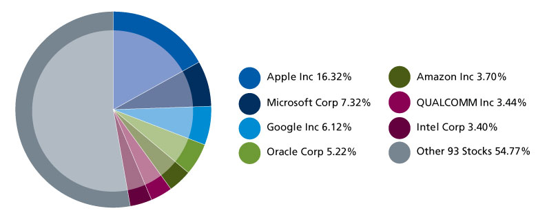
Traditional QQQ Weighting
click for larger graphic

Source: Nasdaq
Long overdue and excellent idea:
Part of the problem with the Nasdaq QQQ’s has bee on the oversize weighting of a few giant market names in it. Certainly Apple (AAPL), but also Microsoft (MSFT), Google (GOOG) and others. Note that chart above dates from 12/31/2012 — after Apple began its slide, and yt still, it was almost 1/6th of the Qs.
The new QQQE is an equal weight set of Nasdaq holdings, each contributing 1% to the overall mix. This reduced Information Technology from 63% to 49%, and raises just about all other sectors in the index.
I’d love to see a chart comparing the cap weighted and equal weighted indices.
UPDATE: February 9 2013 5:39pm
Tom Brakke of The Research Puzzle sends along this chart


What's been said:
Discussions found on the web: