Source: Visualizing Economics
Catherine Mulbrandon covers all sorts of cool data over at Visualizing Economics (Check out her wicked cool book of economic visualizations on income here).
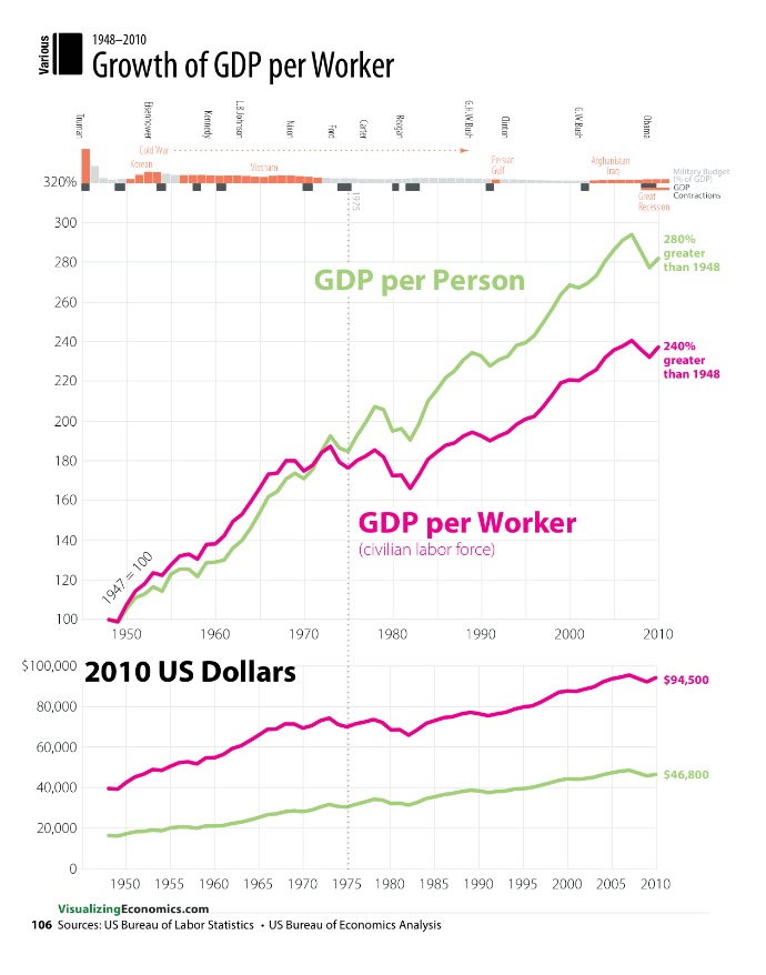
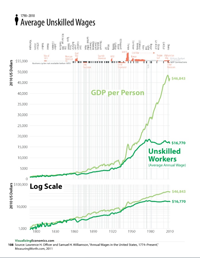
I find the big picture view of employment and wages fascinating, looking at the question, What Happened to Wages?
As the charts above show long-term growth in wages in the US. has been a steady climber, with big spurts in worker productivity (industrial revolution, technology). As the charts show, however, over the last 40 years, long-term growth has slowed significantly.


What's been said:
Discussions found on the web: