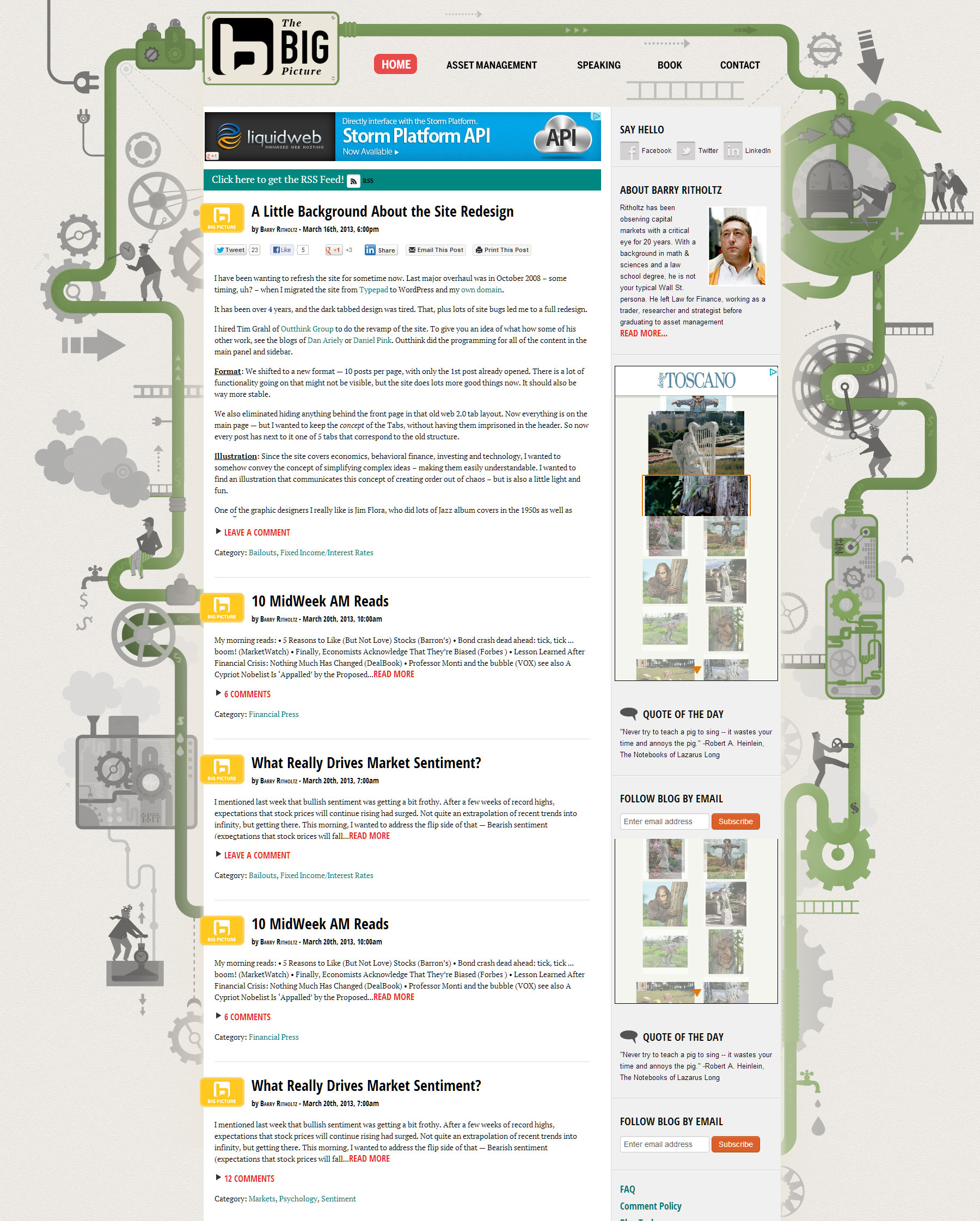
Last week, we rolled out the new site design. Lots of very helpful and productive comments.
Here is the general overview of what most readers were saying:
The positives: Cleaner; Site loads much faster (about 4X); is more stable; creates more meta-data about posts; generates more page views per visitor.
The negatives: Clicking to open pages annoys some; colors are distracting; sidebar is “filler.”
Overall seemed positive, with the two biggest complaints being clicking to open pages and the candy colors.
If the layout were to open every post, there is a load penalty for graphics, flash, charts, video, etc. This applies to all pages, even the ones that you may not be interested in.
That tradeoff is something I don’t want to make, and too be blunt, I don’t find clicking on a page to be all that troublesome. The tradeoff of speed for convenience is huge, and it simply mean you have to click.
Perhaps a good balance could be achieved opening the first 2 or 3 posts.
As to the candy colors, I totally agree — they did not translate that well from the original design to a web version. It is something I plan on changing shortly.
I have been thinking about variations on the illustration theme; one possibility is after the jump.
Please share your thoughts.


What's been said:
Discussions found on the web: