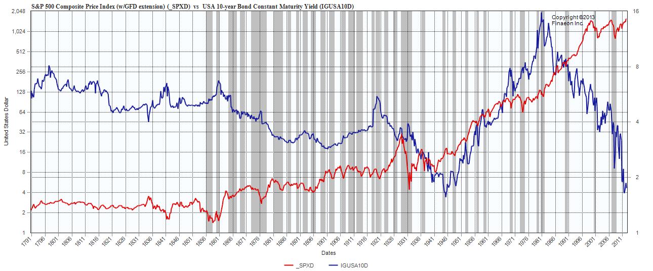
S&P 500 composite vs US 10 yr yield to 1791 (Logarithmic Chart)
Click to enlarge

Source: Global Financial Data
Have a look above at the visual “Boom Bust nature” that the markets, with a little help fromt he Fed and Human Psychology — helps to create. If we overlaid a chart of volatilty, we would see huge spikes every 5 or so years.
It is worth noting the major bubble of the Equity side: 1929 post WW1 bubble, 1996-2000 tech bubble, 2003-07 credit bubble, olus whatever the hell you want to call the current QE driven thingie.
Critiques of Central Bank intervention do not have a whole lot of work to do to place much blame on the Fed for these last 3 boom & bust cycles.
Source:
Ralph M Dillon (rdillon@globalfinancialdata.com)
Global Financial Data
www.globalfinancialdata.com


What's been said:
Discussions found on the web: