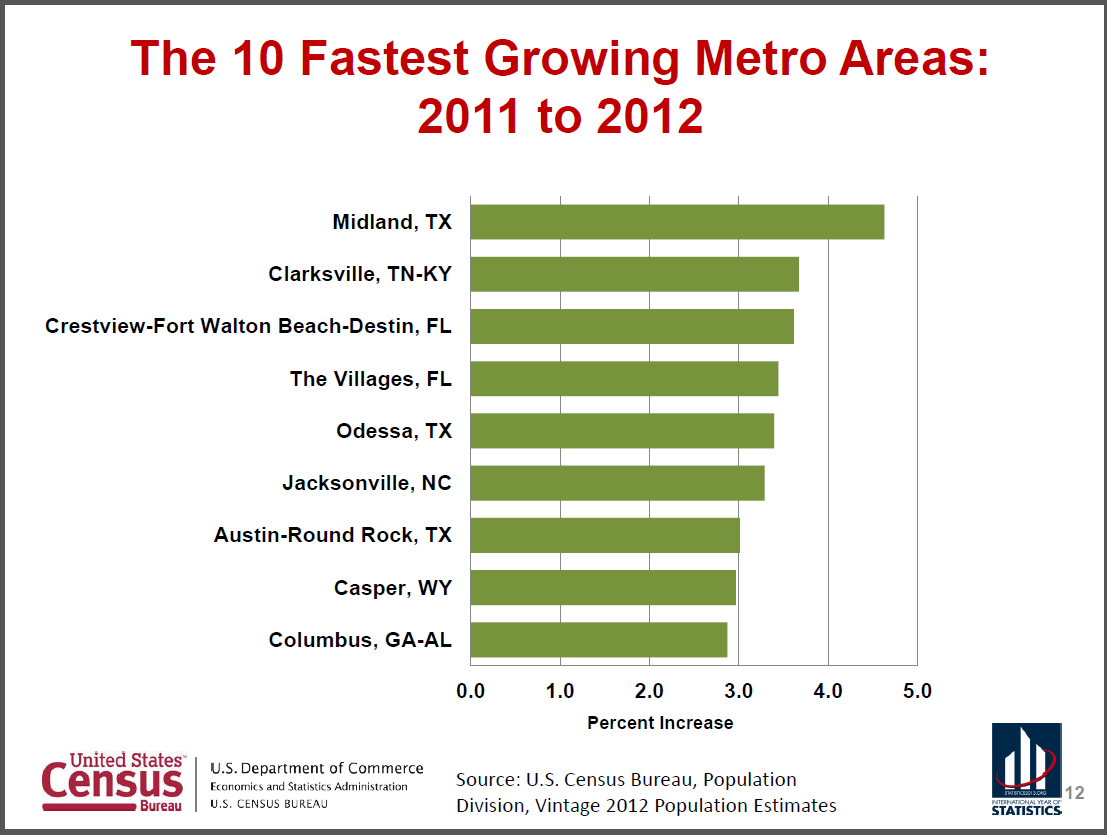
@TBPInvictus here:
Following up on my recent post on Correlation & Causation 101, I delved into various migratory and population estimate datasets at Census.gov. Fascinating stuff. [Note to self: Get a life.] As promised, I also called and corresponded with a contact at Census to be 100 percent certain my criticism of Mr. Moore and Mr. Laffer was well-founded. It was.
That said, I also came upon some neat infographics from Atlas Van Lines – a company that probably moves as many Americans (and Canadians, apparently) as any other.
Here’s their infographic on 2012 Household Moving Migration Patterns. Also, here’s an older link to the reasons we move (based on the exact Census data I wound up digging into that I’m sure Moore and Laffer ignored).

2012 Migration Patterns by Atlas Van Lines
Back for a moment to Mssrs. Laffer and Moore, who cited Census as their source for this claim: “Among the 10 fastest-growing metro areas last year were Raleigh, Austin, Las Vegas, Orlando, Charlotte, Phoenix, Houston, San Antonio and Dallas.”
Census says otherwise. Moore and Laffer got one right; even the folks I contacted at Census had no idea WTF they were talking about. Draw your own conclusions.


What's been said:
Discussions found on the web: