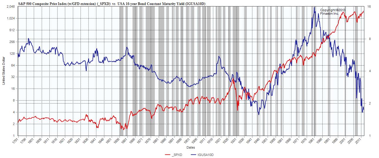
Here is the S&P 500 composite vs US 10 yr yield to 1791.
My goodness look at what they would look like if we could put in trend lines! Over the last couple of days, you have put up some rather interesting charts on the S&P 500 over the short term and they looked crazy. Here we see the complete opposite to the short term.
What I find most interesting about the the equity portion of the chart below is the visual Boom Bust nature that we find ourselves living in and the sheer volatilty that seems to accompany the equity market every 5 or so years. Even more interesting is the Bubbles that we have created and ultimately popped. Some driven on speculation, like the tech bubble during the 1994-2001 period. Some driven on improving fundamentals, 2001-2006 and some driven by the FED in the tune of 85 Billion a month in debt purchases, 2010- pres. In addition, we have been presiding over a market that has had a lot of Central Bank intervention ultimately driving equities higher and 10 yr rates lower.
We have been hearing about a “Great Rotation” that has just not come to fruition. Frankly, an argument can be made that the rotation has come from Precious Metal to equities. In any event, today we are seeing Yields turn back down and equities turn back up. The divergence is unbelievable and makes you wonder if the equity side breakout is sustainable and are yields headed for another historic low?
The one question I have is….Is is really being driven by fundamentals or are we setting the stage for another BOOM followed by a yet another BUST? Will we be adding yet another grey area marked by yet another US recession?
Click to enlarge
Source:
Ralph M Dillon
rdillon@globalfinancialdata.com
Global Financial Data
www.globalfinancialdata.com


What's been said:
Discussions found on the web: