Yesterday, in response to our post on how wrong the public was back in this 2011 Gallup poll, the following suggestion was made:
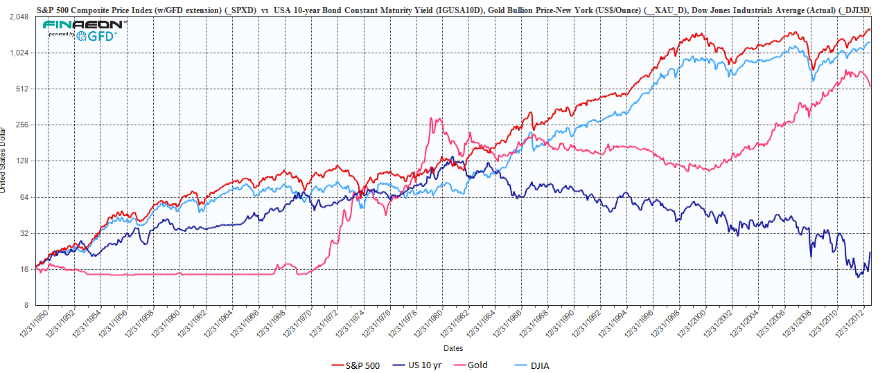
Which asset performed best is dependent on your definition of “long term”. 2011-2013 is at best medium term. Long term to most people means decades, 20 years or more. Look at charts for 1993-2013. For young people starting to invest it means their whole working career. That means around fifty years, given current retirement trends. So look at charts for 1963-2013.
The charts above date from 1950 to present.
Its pretty clear that Gold moves in fits and starts; the Treasury market has had an enormous and unusual bull market, and stocks are volatile gainers over the long haul.
Source:
Ralph M Dillon
rdillon@globalfinancialdata.com
www.globalfinancialdata.com


What's been said:
Discussions found on the web: