
Click to enlarge
Source: J.P. Morgan
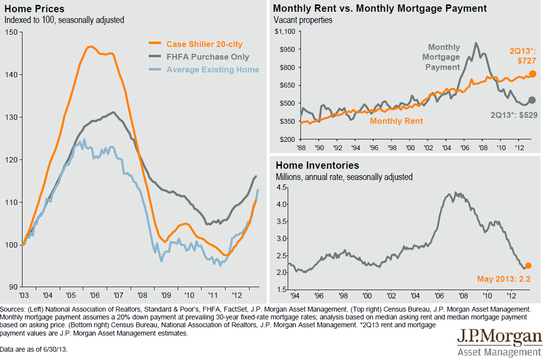
I am off to present to a room full of advisers this AM, but before I leave to tell them precisely where the Dow, Nasdaq and S&P will be in 12 months (to the 2nd decimal place!), I wanted to show the above housing charts.
The three charts show that prices are off the lows (IMO courtesy of ZIRP/QE), Renting remains pricey versus owning, while Inventory is very low.
Back soon . . .

What's been said:
Discussions found on the web: