Click for ginormous chart

Source: Merrill Lynch
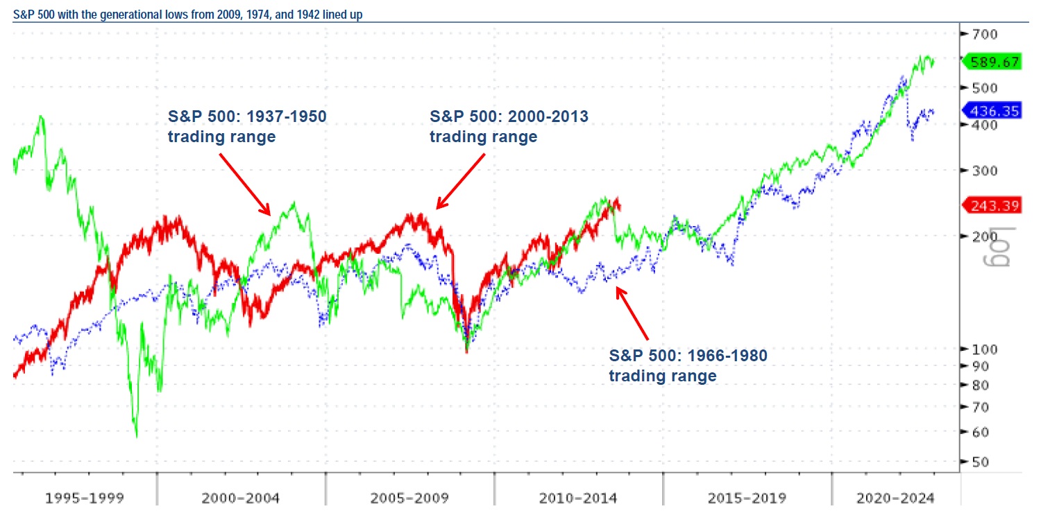
I love the giant chart above using the overlay of the S&P 500 off the 1942, 1974, and 2009 generational lows as a guide. Its beautiful in its simplicity, and has a little something for everyone.
The bulls get a chart that is bullish longer-term, the bears get a broad overview that shows the risk of sell off/trading range for a few years that will be sure to confuse everyone.
Here’s Suttmeier:
In mid-to-late 2013, this risk coincides with the US equity market moving into the weakest part of the Presidential Cycle. The rally off the 2009 low (thick red line) fits best with the rally off the 1942 low (solid green line). After a 1946 peak, the S&P 500 pulled back before decisively breaking out in 1950.
All good stuff . . . .
Source:
Monthly chart portfolio of global markets
Stephen Suttmeier, MacNeil Curry, Jue Xiong
Merrill Lynch, September 10, 2013


What's been said:
Discussions found on the web: