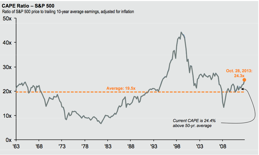
click for ginormous charts


Source: JP Morgan
JP Morgan observes: “Shiller P/E shows the market to be overvalued, but not as extreme if you use the NIPA data.”
I’ve never used the NIPA data, so I have no real opinion on it. The two charts look directionally similar, but different in terms of magnitude.
For those of you bulls in search of some valuation confirmation bias, NIPA is your best bet.
Thoughts?
Source:
Washington Reset: Investing in the Wake of the Shutdown
Dr. David Kelly Chief Global Strategist
J.P. Morgan Funds October 30, 2013


What's been said:
Discussions found on the web: