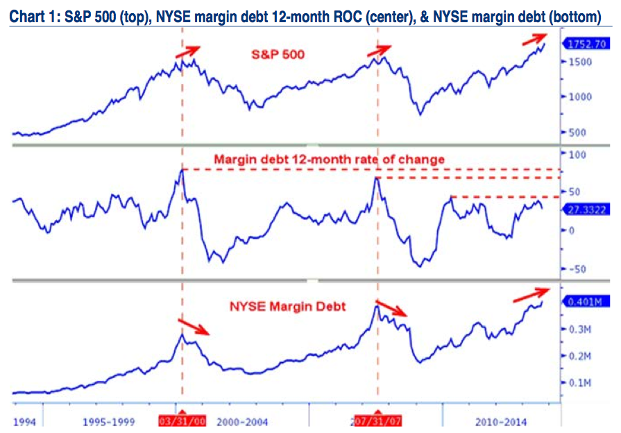
S&P 500 (top), NYSE margin debt 12-month ROC (center), & NYSE margin debt (bottom)

Source: BofA Merrill Lynch
I keep seeing NYSE margin debt showing at record high as somehow a bearish indicator. This may not be supported by the historical data.
Merrill’s Stephen Suttmeier points out that, to the contrary, Margin Debt and S&P500, have often moved together. Indeed, when we look at the rate of change, this has in the past corresponded to a secular breakout in markets.
Here is Suttmeier:
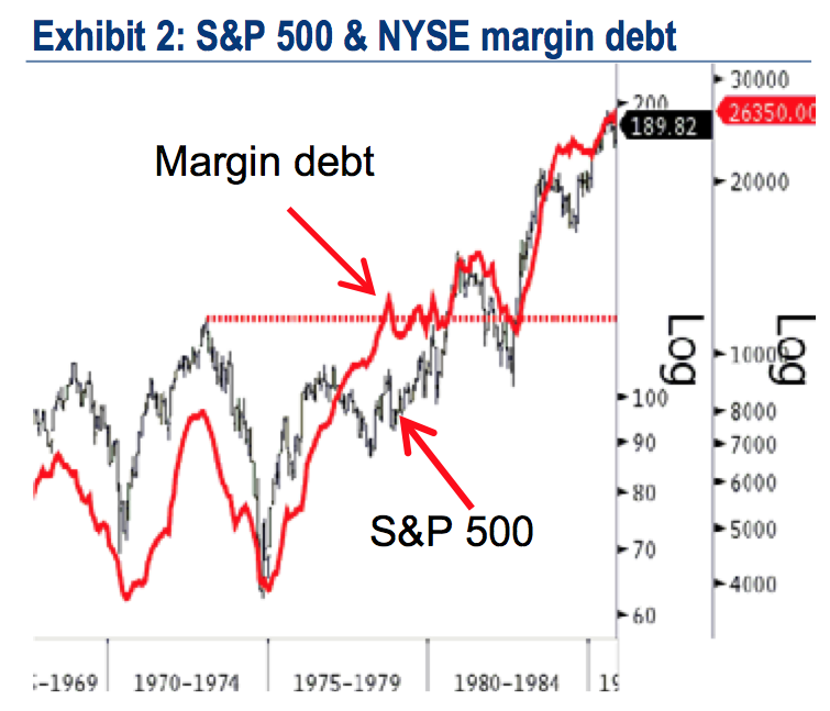
“NYSE margin debt stood at a new record high of $401.2b and exceeded the prior high from April of $384.4b. This confirms the new S&P 500 highs and negates the bearish 2013 set-up that was similar to the bearish patterns seen at the prior highs from 2000 and 2007, where a peak in margin debt preceded important S&P 500 peaks (see Chart 1 on page 2). In addition, a breakout for NYSE margin debt preceded/confirmed the breakout for the S&P 500 in 1980 (Exhibit 2).
In other words, a secular breakout for the US equity market in the early 1980s coincided with a big breakout in the absolute level of NYSE margin debt.
That last sentence is key: If the rate of change data somehow corresponds to past shifts in secular markets from bears to bulls, this is potentially a very significant factor.
S&P 500 & NYSE margin debt

Source: BofA Merrill Lynch
Source:
NYSE margin debt, Net Tabs, & weekly relative ranks
Stephen Suttmeier, CFA, CMT
Chart Talk, Market Analysis
BofA Merrill Lynch


What's been said:
Discussions found on the web: