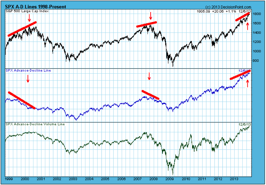
Source: Chart courtesy of Carl Swenlin, Decision Point (annotations by Ritholtz)
One of the best ways to identify a market that is exhausted is to look for divergences between Breadth (i.e. the number of advancing equities versus the number of declining ones) and Price (i.e. new highs). That is a concept that Paul Desmond of Lowry Research has researched and written about many times over the years.
As the chart shows, markets saw major divergences in both 2000 and 2008, as stocks continued to make new highs in prices but failed to do so in the advance-decline line. Prices kept rising, but fewer and fewer issues were participating in the new highs.
Typically, this is reflective of a narrow market being dragged upward by a handful of mega-cap stocks.
That is not what we see today. Market breadth remains broad, with lots of equities participating in the rally. There is not any major divergence between the advance-decline line and equity prices. Hence, the breadth is confirming price, strongly suggesting that this current bull market rally is not over.
Timers and top-callers be warned: We may certainly have minor or intermediate corrections, but this remains a bull market.
Note: We will explore this issue in greater detail at some future date.


What's been said:
Discussions found on the web: