Dear Sirs,
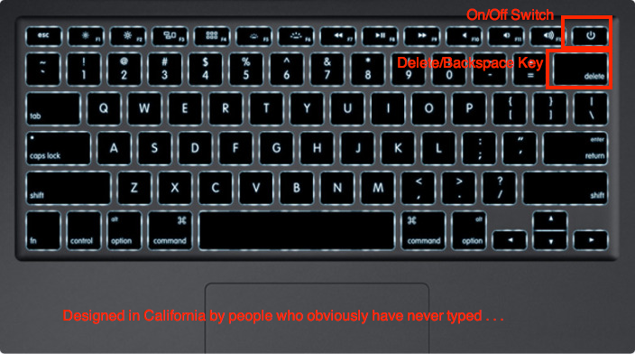
I want to bring to you’re attention a terrible design floor in the MacBook Air laptop: Its power switch.
Unlike the MacBoook Pro that it replaced, someone at Apple placed the on/off switch as part of the keyboard. This is a terrible idea. It makes the laptop that much less usable, less efficient and less pleasant to work with. To be blunt, it represents a terrible compromise of utility for the sake of symmetry and appearances.
It is very unApple like.
I don’t care of you are the world’s greatest typist, eventually, you will accidentally brush this key with your right hand pinkie or ring finger. If you are lucky, you can flip the lid closed, wait a few beats, reopen it, and then enter your password. If the silicon Gods are smiling on you, you can proceed normally. Most of the time, however, you must reboot the entire machine, while muttering “WTF was Jony Ive thinking?” under your breath.
Genius? Hardly.
Making the matter worse, there is no software over ride. I cannot program this key to require a “2 second hold” before taking effect, or even a double click – just the merest wisp of an errant touch ends my session of work.
The good news is twofold: Its a solid state machine, so it reboots quickly. And, when the reboot comes up, all of your work seems to have been saved. In other words, this terrible hardware design is made less painful by an excellent software design.
Thank goodness for small favors.
The on/off is immediately above the very commonly used delete/backspace key, thereby making this error all but inevitable, and revealing its inventor as utterly clueless about Human ergonomics. What makes this so stunning is it comes from a company that, since my MacClassic in 1989, seemed to anticipate, rather than thwart, my intentions.
I have two new laptops to buy for work in January, and while my original plan was to add more MacBook Airs, this flaw makes that much less likely to occur.
Note this was typed on an iMac, which means that I actually go to finish it in one streak, without being interrupted by a poorly designed, poorly placed on off key.
Here’s hoping you get your shit together soon,
Barry Ritholtz
~~~
Designed in California by people who apparently have never typed . . .


What's been said:
Discussions found on the web: