
Source: Federal Reserve Bank of Philadelphia
Via the Federal Reserve Bank of Philadelphia, by way of Business Insider, I decided to see what we could do if that was an animated GIF instead of static charts.
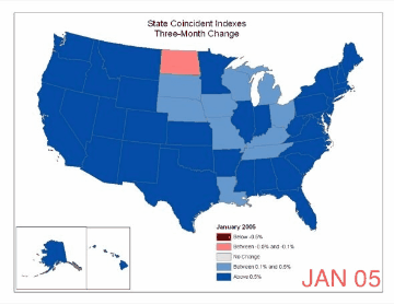
The net result shows the month-to-month change from January 2005 – January 2014 of the Philly Fed’s coincident index. The index Philly Fed is their latest assessment of economic activity across the country. Its color-coded, blue or green = expansion, while red = economic contraction. As the FIG above shows, the nations goes from boom to bust and back again.
What is so striking is the inevitable cyclical nature of the collapse and recovery. From boom to bust and then back again. Recall those people in 2007 and 2008 and even as late as September 2008 who were claiming that there was no recession. The data shows overwhelmingly how wrong these people were, how little respect for data they had, how weak their analytical skill sets were.
The once the economy began to turn, another group of folks continued to insist there was no recovery (although there was some overlap). Again, the data said something else.
Perhaps I should Update this every 6 months or so . . .

What's been said:
Discussions found on the web: