click for larger chart

Source: Visualizing Economics
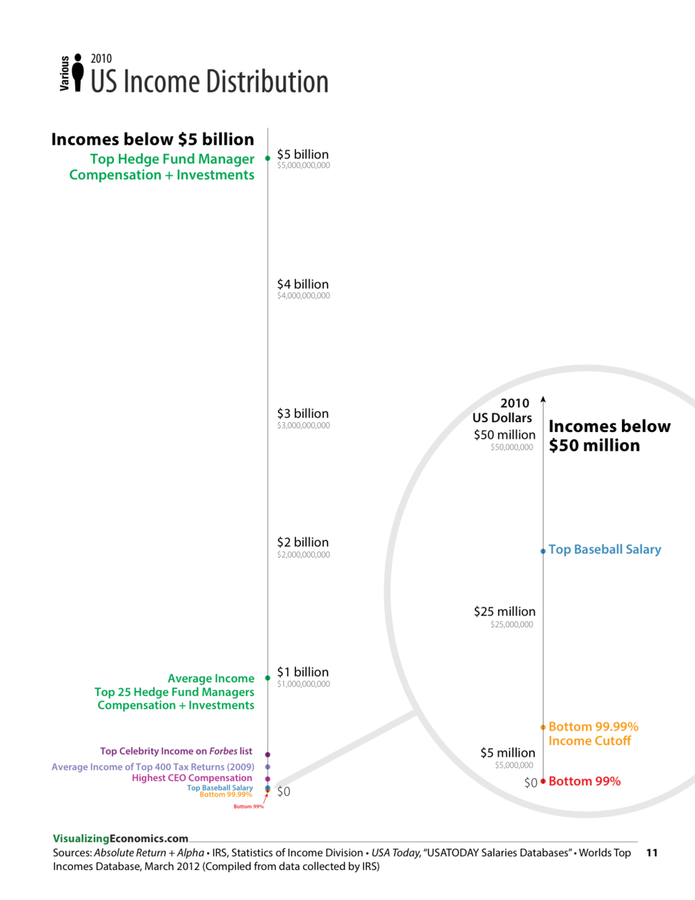
When it comes to the top 0.01 percent of earners, it is extremely challenging to describe the differences in terms of income. Words often fail to convey the massive range.
Fortunately for us, Catherine Mulbrandon of Visualizing Economics has put together a simple chart that shows just how fantastic the spread was in 2010 between those who are merely rich and the fabulously wealthy. This is an unweighted scale. It isn’t skewed for population. It merely ranks top incomes by dollars earned.


What's been said:
Discussions found on the web: