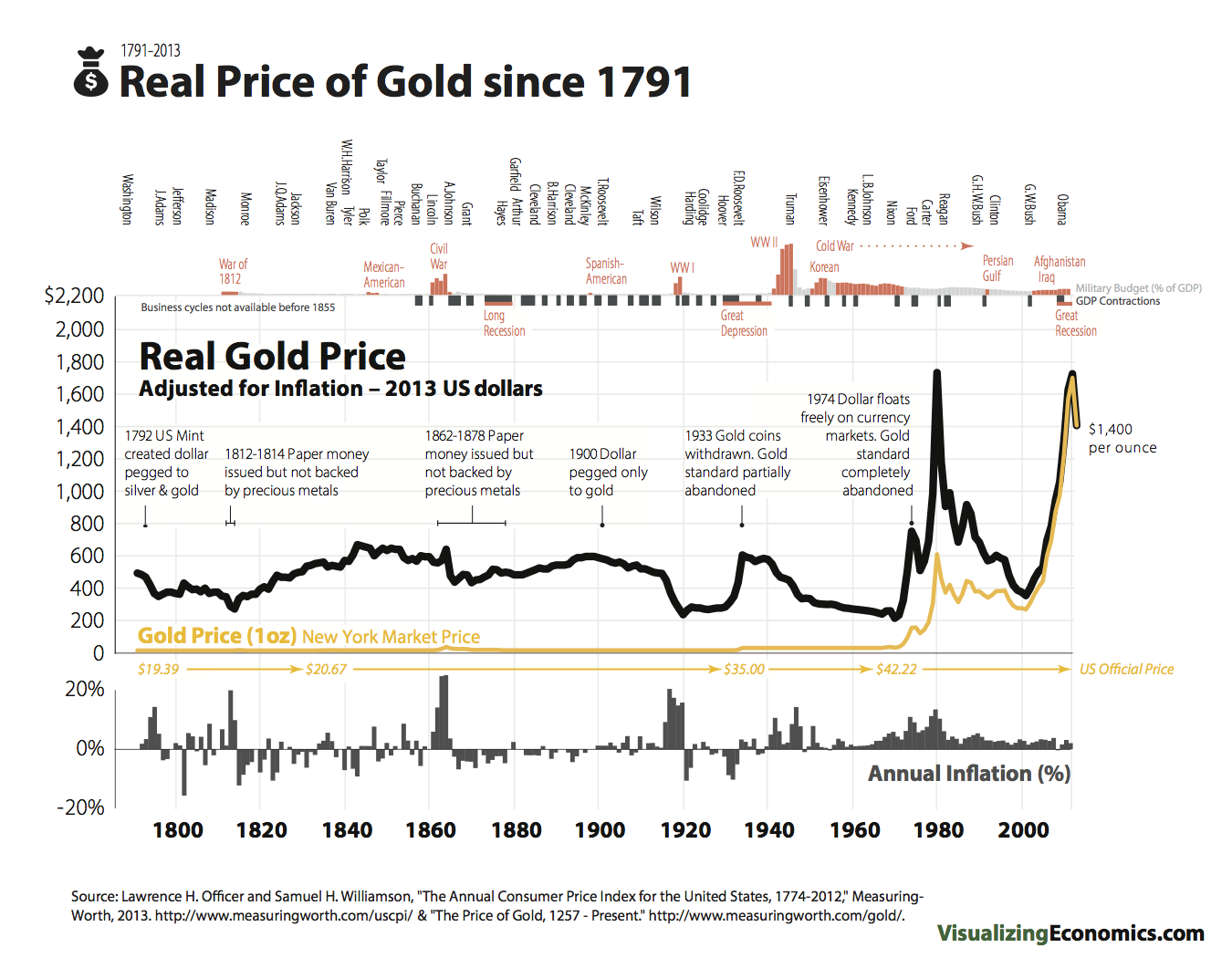
click for ginormous graphic

Source: Visualizing Economics
Earlier this year, we discussed the Lessons Learned from the Fall of Gold. That surprisingly generated some controversy despite the near 40% collapse from its 2011 peak.
Rather than spill a lot of ink onto the page, I wanted to direct your attention to the following graphic from Catherine Mulbrandon of Visualizing Economics. It is the real price of Gold, adjusted for inflation.


What's been said:
Discussions found on the web: