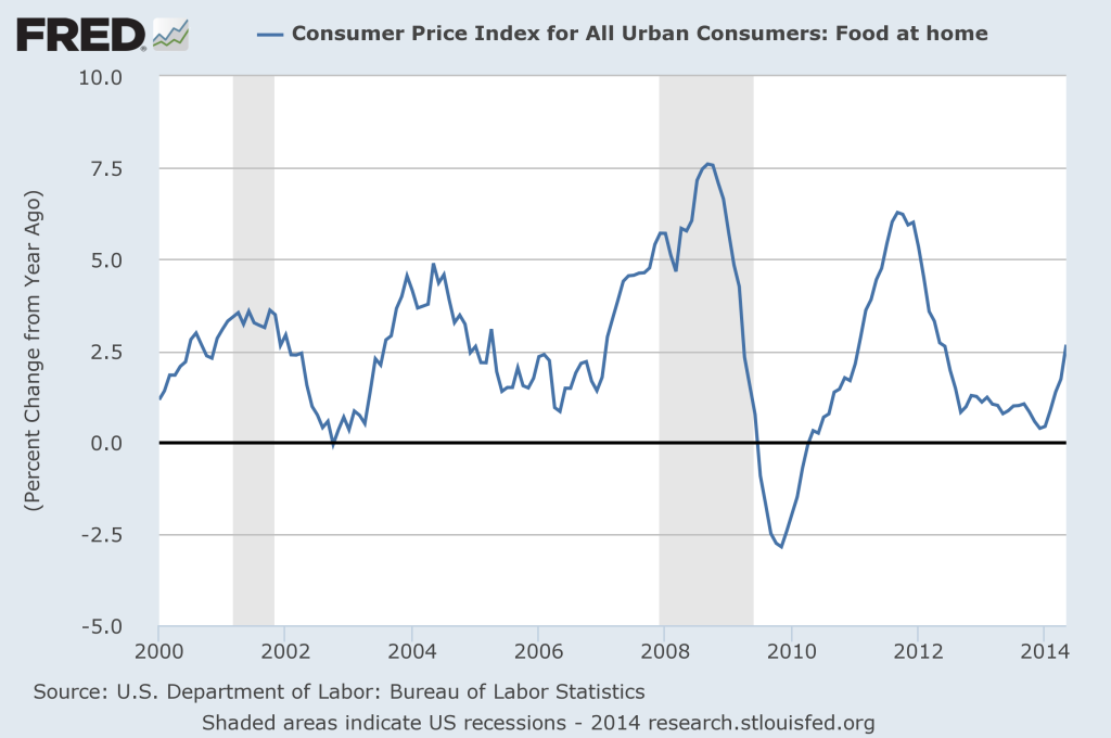
click for ginormous chart

Source: FRED
This morning’s column on Inflation truthers led to some emailers insisting inflation numbers are much higher post crisis than pre.
Sorry, but the data says that is simply not true.
Play with the attached FRED XL spread sheets all you want, the data is hard to argue with. (Same goes for energy, especially Oil), Cherry pick whatever time period you want. Tweaj the charts on FRED.
From 2000 to the end of 2008, Food at home averaged 3.00% year over year increases; since 2009 until today, its only been 1.78%.
With Oil, its much more dramatic: Oil averaged 24.9% year over year price increases from 2000 to 2008; Since 2009, its averaged a far more tame 6.5%.
Spreadsheets:


What's been said:
Discussions found on the web: