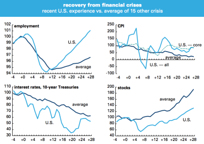
Major economic indicators from 4 quarters before to 28 quarters after financial crises. Line marked “average” shows the average performance in 15 major financial crises since 1973, as identified by the IMF in the April 2009 edition of its World Economic Outlook, Index set so quarter of onset = 100. For the recent U.S. crisis, the quarter of onset is 2007Q3.
~~~
“It probably will come as a big surprise to most people that employment is actually doing better and the stock market is doing worse than the typical post credit crisis recovery.” So say Philippa Dunne and Doug Henwood of the Liscio Report. They have been updating a chart that found its origins in an IMF report featuring a study of major banking crises done by academics Carmine Reinhart and Ken Rogoff.
The nearby chart, four major economic indicators – Employment CPI, interest rates, and stocks – compare this recovery versus the average of 15 prior financial crises. Much of the anecdotal criticisms of this recovery have been that employment has been lagging while the stock market has run too far. But as you can see in the updated IMF chart, United States employment is actually above the average post crisis recovery.


What's been said:
Discussions found on the web: