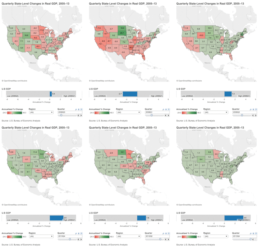
The U.S. Bureau of Economic Analysis (BEA) recently released a trove of data on the individual state economies. You can zoom in on quarterly state-level gross domestic product (GDP) series begins from 2005 through the 2013 at Macroblog of the FRBA.
But I thought it might be instructive to see what the map looks like if we can animate each quarter:
How states have fared since 2005 relative to the economic performance of the nation as a whole.

h/t Macroblog


What's been said:
Discussions found on the web: