Source: MoJo
Last time we looked at this subject, we noted that There’s Rich, Then There’s the 0.01%.
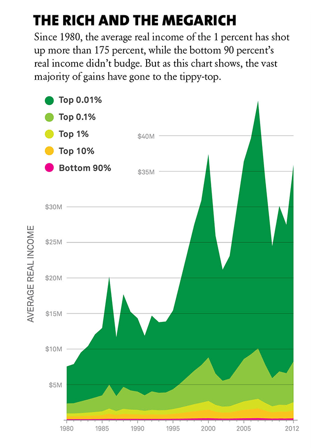
Since then, the disparity between rich and poor, as well as the rich and the really rich have widened further. As the chart above shows, the gap between the bottom 90% (in pink) and the top 1% (in light green) has expanded. But that differential is dwarfed by the changes between the top 0.01% – naturally shown in the dark green color of money – and everyone else.
Using data from Berkeley’s Economics professor Emmanuel Saez as well as the data that Thomas Piketty made available.


What's been said:
Discussions found on the web: