
click for ginormous chart
Source: JP Morgan
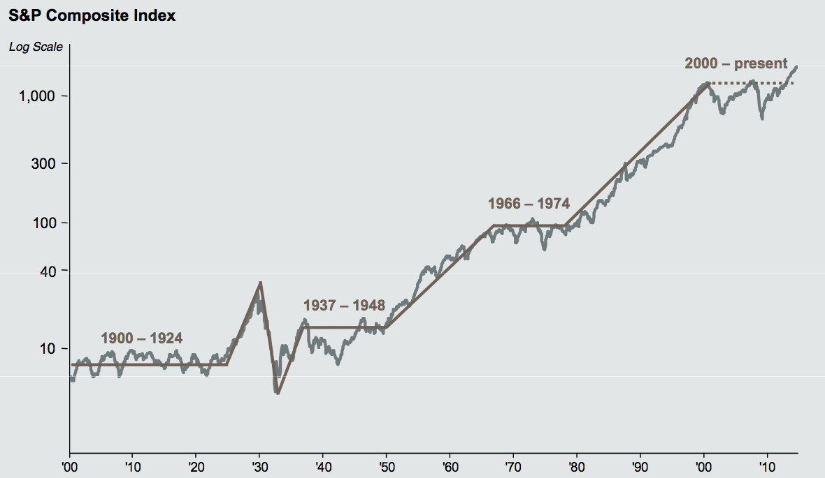
One of my favorite charts to show people is the long-term market returns since 1900. I find it is incredibly telling in the information provided by a very simply line chart.
Have a look at the chart nearby. It is from JP Morgan’s quarterly chart book which (I have referenced previously). It’s a delightful assembly, chock full of great graphics that both inform and amuse.
The chart we are focusing on today is Markets since 1900. It shows the long-term gains of the S&P500 (and its predecessor). It is in logarithmic scale, so as to not distort the earlier returns.

What's been said:
Discussions found on the web: