click for interactive chart

Source: WSJ
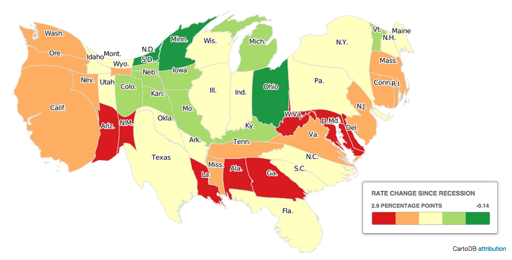
Great set of interactive charts at the WSJ showing differing views of American employment. Maps include Jobless Rate Change, 2013-14; Labor Force Percentage Change, and the map above of Jobless Rate Change Since the Great Recession Began.
The cartograms are sized not by their physical acreage, but rather by their civilian labor force populations. It is a density-equalized view of regional employment.
Click through to WSJ to see the other versions.


What's been said:
Discussions found on the web: