Click through for the interactive graphic.
Source: Bloomberg
This content, which contains security-related opinions and/or information, is provided for informational purposes only and should not be relied upon in any manner as professional advice, or an endorsement of any practices, products or services. There can be no guarantees or assurances that the views expressed here will be applicable for any particular facts or circumstances, and should not be relied upon in any manner. You should consult your own advisers as to legal, business, tax, and other related matters concerning any investment. The commentary in this “post” (including any related blog, podcasts, videos, and social media) reflects the personal opinions, viewpoints, and analyses of the Ritholtz Wealth Management employees providing such comments, and should not be regarded the views of Ritholtz Wealth Management LLC. or its respective affiliates or as a description of advisory services provided by Ritholtz Wealth Management or performance returns of any Ritholtz Wealth Management Investments client. References to any securities or digital assets, or performance data, are for illustrative purposes only and do not constitute an investment recommendation or offer to provide investment advisory services. Charts and graphs provided within are for informational purposes solely and should not be relied upon when making any investment decision. Past performance is not indicative of future results. The content speaks only as of the date indicated. Any projections, estimates, forecasts, targets, prospects, and/or opinions expressed in these materials are subject to change without notice and may differ or be contrary to opinions expressed by others. The Compound Media, Inc., an affiliate of Ritholtz Wealth Management, receives payment from various entities for advertisements in affiliated podcasts, blogs and emails. Inclusion of such advertisements does not constitute or imply endorsement, sponsorship or recommendation thereof, or any affiliation therewith, by the Content Creator or by Ritholtz Wealth Management or any of its employees. Investments in securities involve the risk of loss. For additional advertisement disclaimers see here: https://www.ritholtzwealth.com/advertising-disclaimers Please see disclosures here: https://ritholtzwealth.com/blog-disclosures/
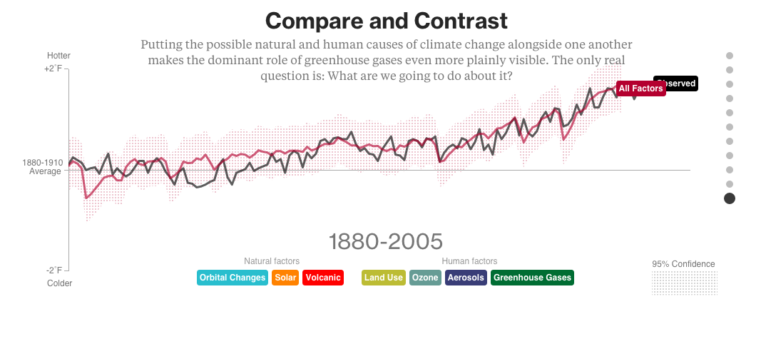
This is a really nice way of using graphics to explain a multivariate model. A number of different factors can influence temperatures so you look at each separately, and then bring them into a combined model that nicely fit the actual observations.
What can we do about it?
By their model: chop down more trees, emit more aerosols, instigate volcanic activity.
The authors of the graphic ignored the LITTLE ICE AGE that ended in 1870 http://www.eh-resources.org/timeline/timeline_lia.html
By limiting the analysis to the last century, they have excluded a centuries-old trend that determined their baseline.
It is interesting how in the mediaspace the argument goes back and forth between global warming and climate change.
The authors talk of a 40% increase in CO2 since 1750, but don’t mention the 780% increase in human population.
Gotta recommend the documentary Chasing Ice as it has a terrific graphic that shows the natural variability in CO2 levels going back more than 500,000 years and makes an incredibly convincing argument that CO2 levels have soared due to human activity, especially since the dawn of the Industrial Revolution.
It’s kind of a “Duh, Sherlock” point, except for the presence of the intellectually stunted right-wing cabal who oppose anything not based on Family Values. Speaking of Family Values, Bristol Palin is once again preggers out-of-wedlock, but I guess the right-wingers will look past it because it must get awfully lonely staring over the back fence at Russia.


How are we going to trade this Barry ?
~~~
ADMIN: Intelligently
This is a really nice way of using graphics to explain a multivariate model. A number of different factors can influence temperatures so you look at each separately, and then bring them into a combined model that nicely fit the actual observations.
What can we do about it?
By their model: chop down more trees, emit more aerosols, instigate volcanic activity.
The authors of the graphic ignored the LITTLE ICE AGE that ended in 1870
http://www.eh-resources.org/timeline/timeline_lia.html
By limiting the analysis to the last century, they have excluded a centuries-old trend that determined their baseline.
It is interesting how in the mediaspace the argument goes back and forth between global warming and climate change.
The authors talk of a 40% increase in CO2 since 1750, but don’t mention the 780% increase in human population.
Gotta recommend the documentary Chasing Ice as it has a terrific graphic that shows the natural variability in CO2 levels going back more than 500,000 years and makes an incredibly convincing argument that CO2 levels have soared due to human activity, especially since the dawn of the Industrial Revolution.
It’s kind of a “Duh, Sherlock” point, except for the presence of the intellectually stunted right-wing cabal who oppose anything not based on Family Values. Speaking of Family Values, Bristol Palin is once again preggers out-of-wedlock, but I guess the right-wingers will look past it because it must get awfully lonely staring over the back fence at Russia.