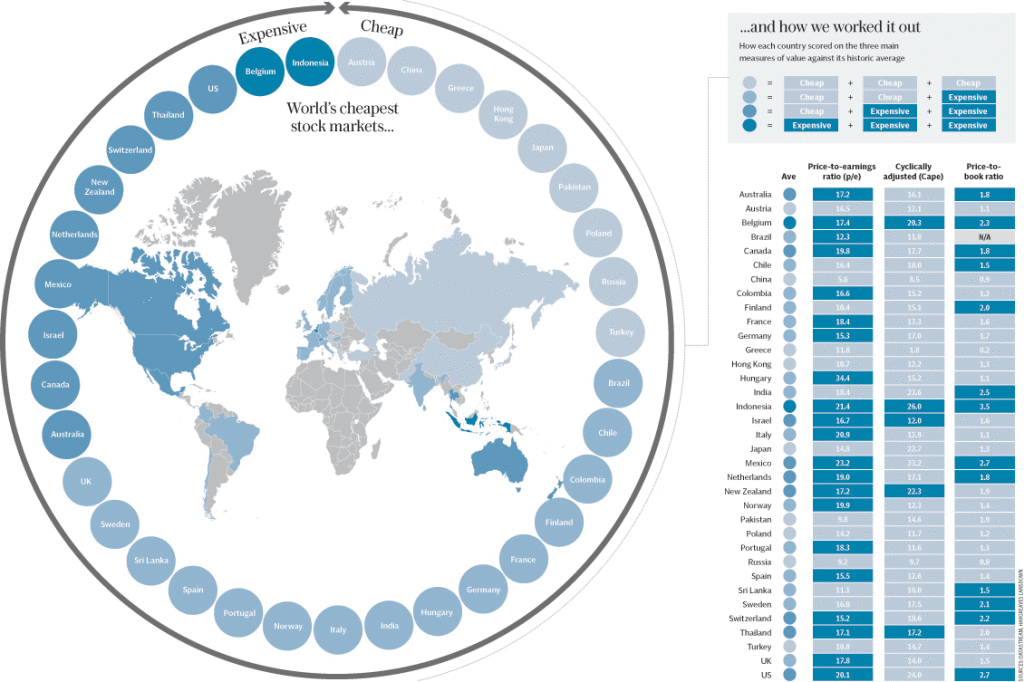
Terrific graphic from the Telegraph showing where the world’s cheapest markets are:
Click for ginormous graphic

Source: Telegraph
The graphic here shows three valuation measures: the price-to-earnings ratio; Cape; and price-to-book ratio. Each market is compared to its own historical average, as differing market characteristics mean direct comparisons between countries can be misleading.


What's been said:
Discussions found on the web: