
This is wicked cool graphic, perfect for the day before NFP.
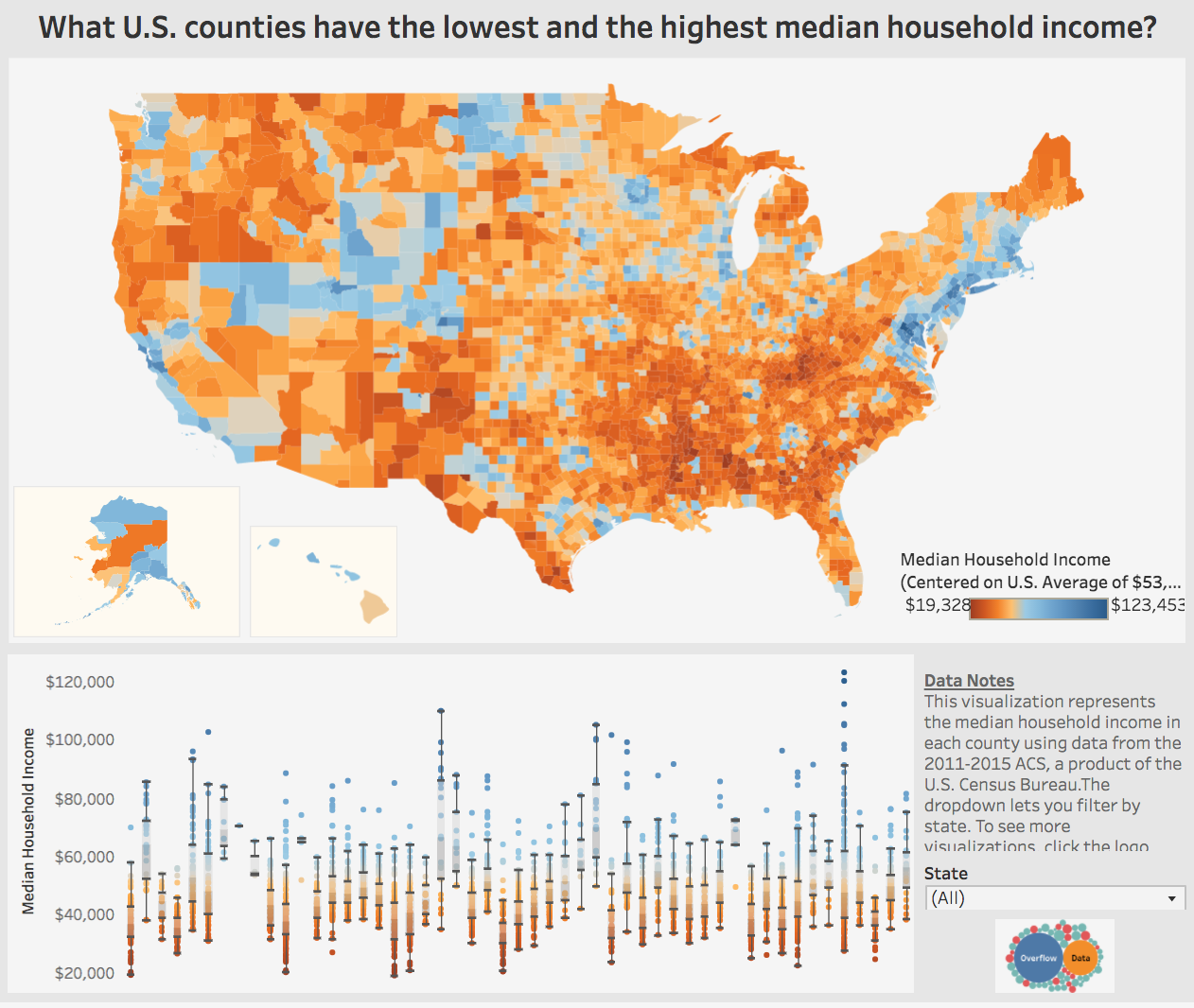
Note the areas in blue — these are the local municipalities that can afford higher minimum wage; the deep red orange are likely going to have difficulty affording big increases.
There is a chicken & egg aspect to this, as wealthier areas (shown by color) can afford higher minimums but simultaneously have much higher costs structures to live in those areas.
Click for the Tableau chart.
Source: Visual Capitalist
