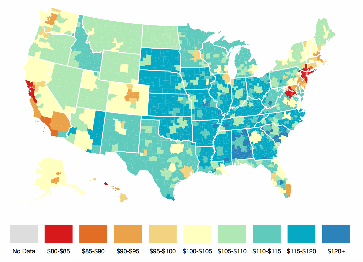
The Tax Foundation has an interesting graphic, showing purchasing power differences at the metropolitan level, i.e., how far $100 dollar goes city by city.
Two caveats: Everything you buy at retail is indirectly a function of local real estate prices. This is why buying food in a Manhattan supermarket is not very much cheaper than going out to dinner.
Second, there is always an intense inter-relationship to local prevailing wages and cost of living. Prices are higher where people get paid more.
Its a function of whether you have more time or money: the nature of local economies, the ways pricing power works shifts when people’s time is valuable and they cant spend much time traveling to save a few dollars.
I am surprised at some of the metropolitan groupings — New York-Newark-Jersey City? — but its an interesting map nonetheless:
click for interactive map

Source: Tax Foundation, Bureau of Economic Analysis

