
I am working on a longer commentary, but in the meanwhile, I wanted to share three quick charts which are incredibly instructive about wage-push inflation, and what it might mean. I separating these from that inflation discussion because I suspect economists are thinking about wage inflation all wrong.
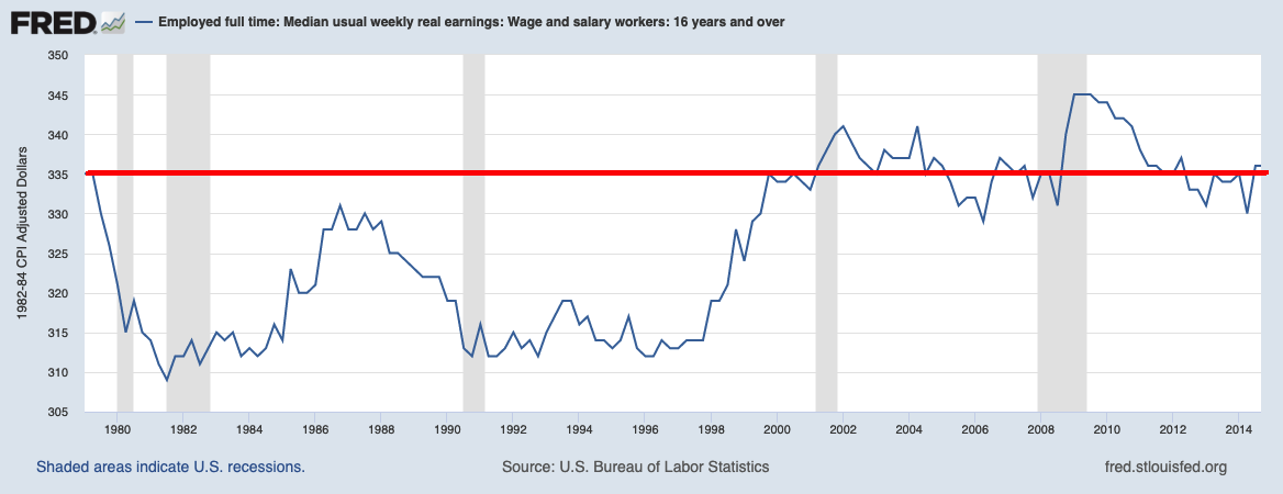
Consider the real wages chart, above. It may be hard to imagine, but for the 35 years from 1979 to 2014, real median wages were flat. Meaning, adjusted for inflation, workers are getting the same buying power they had the year I graduated High School. three and a half decades later, they began ticking higher (2015) when the post-GFC economy saw unemployment really head to cyclical lows; it then accelerated higher in 2020-21.
Even worse, minimum wage, adjusted for inflation, was the same in 2015 as it was in 1949. This is why I have been saying the big uptick in wages is really a lagging giant catch-up:
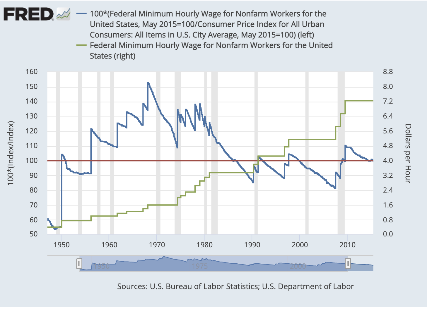
This raises a fascinating question: Are economists approaching wages backward? Should they be asking why low-end wages have been a DEflationary factor over the past 7 decades? Maybe we should wonder why the minimum wage has lagged productivity, profits, C-Suite comp, and inflation? Hence, we might consider these rising wages as less of an inflationary impulse — and more of a “partial unwind of decades of lagging, deflationary, low-end wages.”
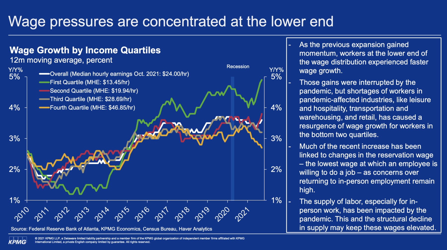
The second chart I want you to see is below, from Constance Hunter of KPMG. She points out that it is the bottom quartile that is pulling up wages. This is consistent with that pesky wage reset I keep bringing up.
More on this tomorrow . . .
