I have long wanted to collect my thoughts about some of the issues — masked in part, I believe, by the two bubbles we’ve had in the past 11 years — that are exacerbating our current crisis and will continue to forestall any semblance of a robust recovery.
This issue has been vexing me for a while. I think the reason is that there are so many disparate yet loosely connected ideas banging around in my mind that it’s been a challenge to figure out where to start and how to tie it all together. That and the fact that my anger at our collective indifference to these matters is probably clouding my thinking. So, apologies in advance if this is a bit disjointed. All this stuff is most definitely interconnected, and I’ve tried to bring it together as coherently as possible without turning it into my master’s thesis.
I’ve written previously (maybe here, for sure elsewhere) that my biggest concerns are always jobs (that we create them) and incomes (that they’re decent and rising), in that order. We are failing on both fronts, and the asshats in Washington (both sides, to be sure) seem to have decided there are more pressing issues to address and/or that we’ve reached the end of the line and there’s nothing that can be done on either front so we’d just better suck it up and adapt. Worse, what really worries me is that there are very disturbing long-term trends that no one seems to want to acknowledge, no less try to remedy, that contributed mightily to the crisis we just struggled through — and may well again if corrective measures aren’t taken.
We know from the NFIB that the “Single Largest Problem” facing their membership is Poor Sales. We know that Poor Sales and the Unemployment Rate are very highly correlated (+0.86), as I demonstrated here in February. Poor Sales implies a lack of demand (or poor business decision-making, like selling parkas in Hawaii) — not uncertainty about Obamacare, tax rates, or other government rules and regulations (which are, by the way, also potential answers to that same poll question). Larger corporations have also indicated soft demand for their products. How to increase demand? Well, real disposable income could go up, but it isn’t — or Americans could borrow more, which they aren’t. Let’s have a look under the hood.
Here’s a brief discussion of the disturbing long term trends have only exacerbated our problems and are rarely, if ever, mentioned in my regular econo-surfing.
Income Inequality
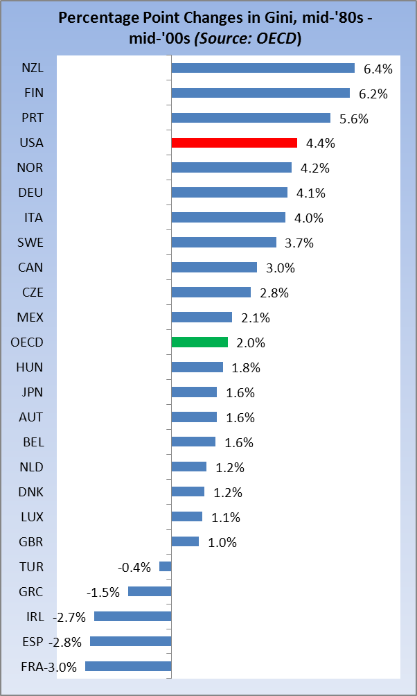
Our Gini Coefficient has been rising for decades, indicating growing income inequality.
(Bonus points to the commenter who, without a shred of evidence, attempts to link the current financial crises in Greece, Ireland, and Spain to the fact that their Gini Coefficients have declined over 20 years.)
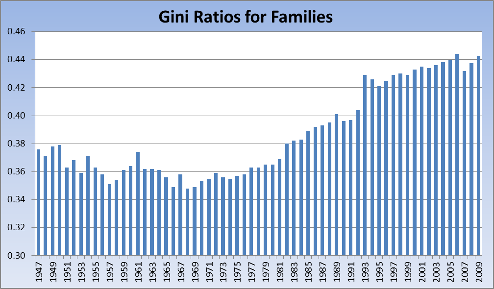
Our own Census data (chart below for the United States only) would indicate that United States income inequality has increased even more than that measured by OECD (I calculate it at just over a 5% percent gain from mid-’80s to mid-’00s, but in either case the trend is not a good one):
Source: Census.gov, Income Inequality, Table F-4
There are many footnotes to all the Census data presented in this post; please see them here.
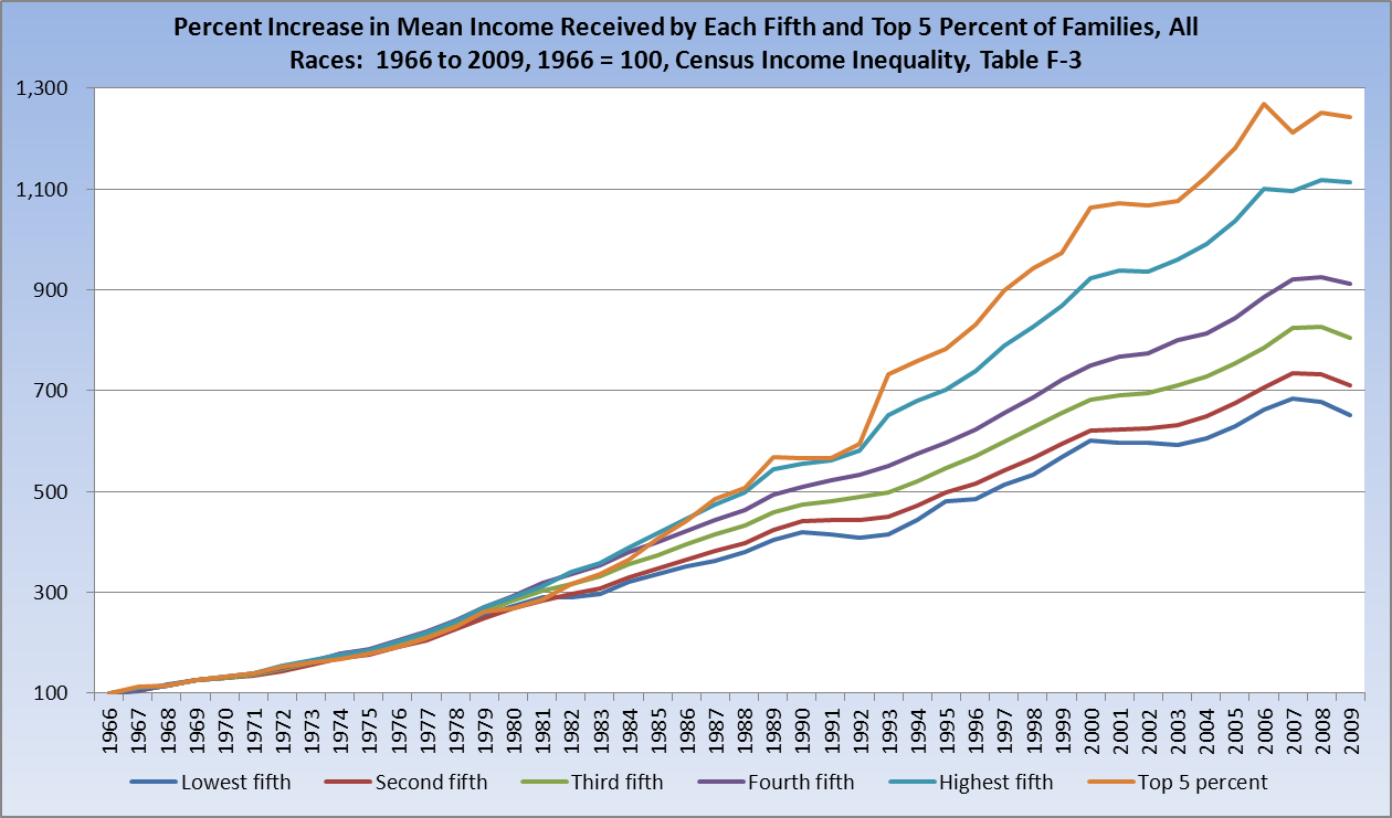
How is it that the Gini Coefficient is increasing? Here’s a look at exactly how:
The chart immediately above is, by the way, completely consistent with the stock of a company like Tiffany (NYSE:TIF) recently hitting an all time high — as have some other luxury retailers. You see where I’m going here? If not, see here or here. Or here.
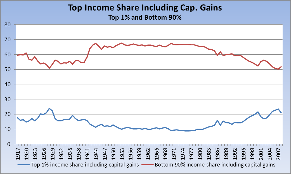
Beginning in the latter years of the Reagan administration, the income share relationship between those at the very top — the top 1% — and the vast majority of the country — the bottom 90% — began to shift dramatically:
Source: Paris School of Economics
It’s my personal opinion that we have worked our way toward the end of “trickle down” economics and, while of course others are free to feel differently, I label it a failure. When it’s available, it will be interesting to add the most recent data to the chart above.
Spending Capacity
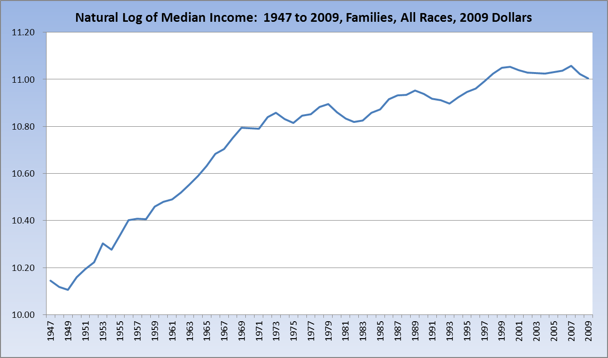
Here’s a look at families’ median income from 1947 to 2009. It’s a replica of a chart Paul Krugman ran here that I’ve been meaning to get to for a while. It is hard — if not impossible — to satisfy ever-increasing demand with stagnant income, unless one borrows more.
Source: Census.gov, Income Table F-12
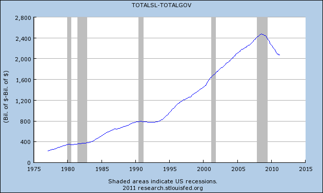
Credit is still contracting, and probably will for some time to come. Even when it stops contracting and starts to expand again, I believe there has been a fundamental change in the way Americans are going to view its use. Here’s Total Consumer Credit less Total Government Loans (i.e. student loans):
The Kicker — American Labor is Getting a Smaller and Smaller Slice of the Output Pie
Now, what’s most troubling is that among the reasons income is going nowhere is the simple fact that American workers are getting less of the spoils, as clearly evidenced by their “labor share.” We can determine fairly easily what share of the fruits of our labor are coming back to us in wages, salaries, and benefits, as we see here:
Per the BLS (third article, Chart 5 reproduced below):
Labor share is the portion of output that employers spend on labor costs (wages, salaries, and benefits) valued in each year’s prices. Nonlabor share—the remaining portion of output—includes returns to capital, such as profits, net interest, depreciation, and indirect taxes. [Emphasis mine for later reference.]
When labor share is constant or rising, workers benefit from economic growth. When labor share falls, the compensation–productivity gap widens.
Labor share averaged 64.3 percent from 1947 to 2000. Labor share has declined over the past decade, falling to its lowest point in the third quarter of 2010, 57.8 percent. The change in labor share from one period to the next has become a major factor contributing to the compensation–productivity gap in the nonfarm business sector.
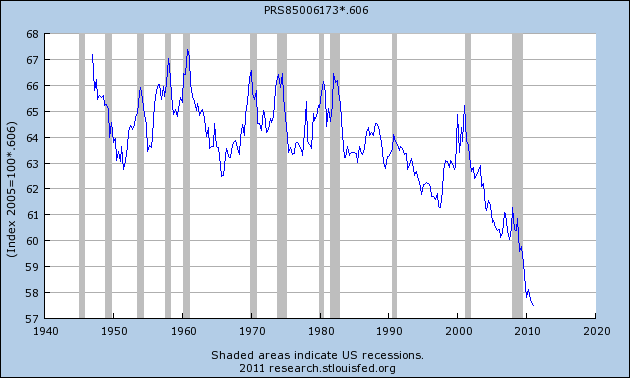
So, how are Americans doing? Here’s the history of the series (PRS85006173 — Nonfarm Business: Labor Share):
NOTE: BLS provides (and FRED captures) this series as an Index, not a Level, with 2005 = 100. BLS advises me that the 2005 Level = 60.6. Therefore, I have taken the entire Index (Series identified above) and multiplied it by .606 to get the percent Labor Share above; it is identical to what you will find in the Census document I cite (except that mine is through Q1 2011). As an aside, it’s interesting to note that the peaks in this series generally coincide with recessionary periods — output (the numerator denominator) goes down while wages (the denominator numerator) generally remain a fixed expense (thanks for the correction, jaysan, and sorry for the error). Of course, that pattern is now completely broken, and Labor Share stands at an all-time low of 57.5.
Dave Rosenberg wrote about Labor Share in his note June 3:
The labour share of national income has fallen to its lowest level in modern history — down to 57.5% in the first quarter from 57.6% in the fourth quarter of last year, 57.8% a year ago and 59.8% when the recovery began. Some recovery it has been — a recovery in which labour’s share of the spoils has declined to unprecedented levels. Look, we aren’t Marxists, but one has to legitimately wonder what the social consequences are going to be if this downtrend persists; not to mention the political consequences.
This is a very disturbing development, and Dave finishes his commentary on this as follows:
Even if you are an ardent capitalist (which I am), the chart below [ed note: Below in his commentary, above here] should be leaving you with a bit of a queasy stomach — extremes like this, unfortunately, never seem to lead us to a very stable place.
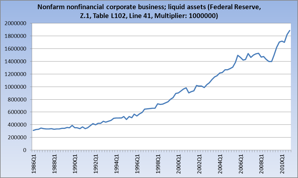
So, where’s the nonlabor share of the equation showing up (see reference above)? How about, in large part, on the balance sheets of nonfarm nonfinancial corporations — in their liquid assets:
And those are the nonfinancial companies that weren’t showered with government largesse and arguably made their money the old-fashioned way: They (presumably) earned it (unlike the banksters).
Like Dave, I consider myself an ardent capitalist. But what we’ve got now isn’t capitalism — it’s some warped perversion of capitalism that is leading us to a very troubling place. As long as Congress continues to play Jerry Mahoney to corporate America’s Paul Winchell, color me decidedly dour on the outlook. The parasite has almost killed its host.
For another look, I would highly recommend this piece by NDD over at Bonddad’s blog.
Sources, Reference Material, Interesting Reading
Census.gov databases on Income and Income Inequality
OECD Statistics Portal and New Beta Version


What's been said:
Discussions found on the web: