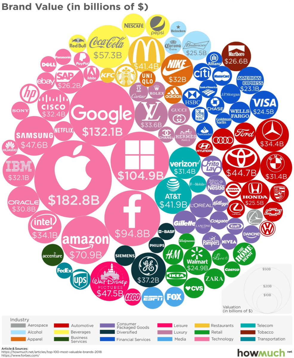
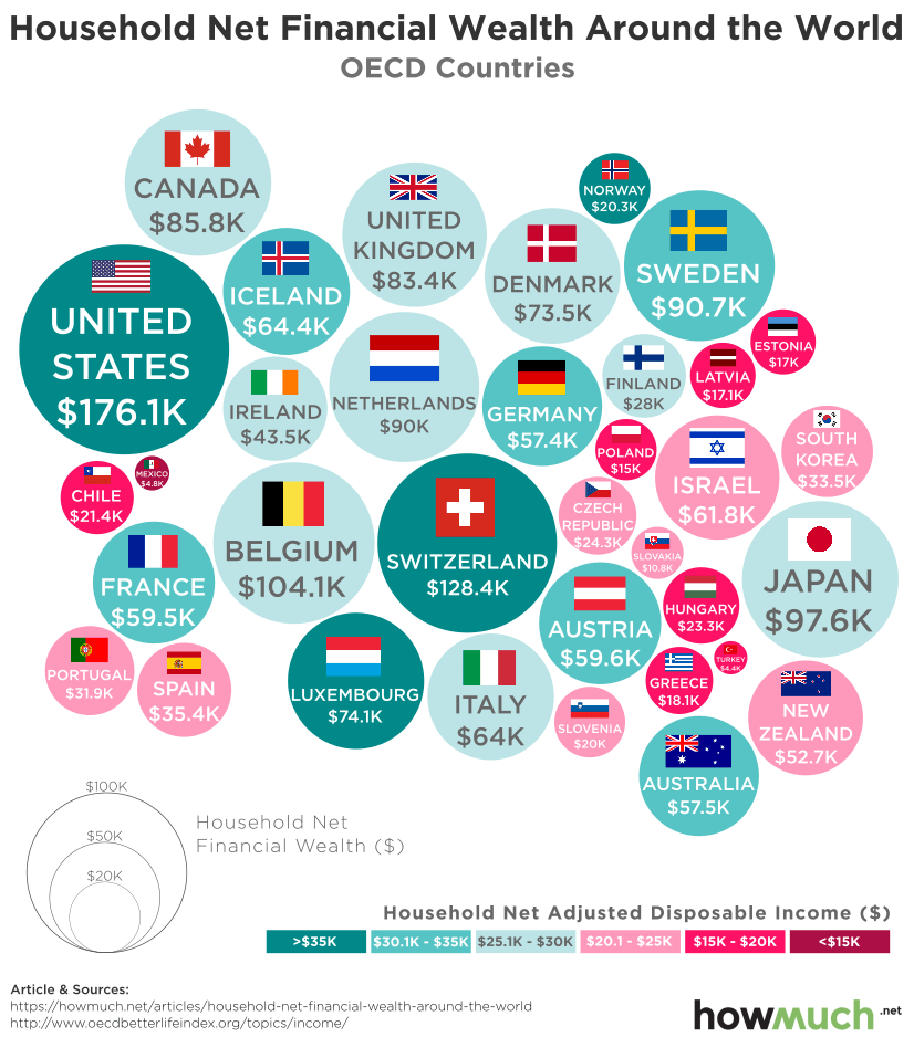
 I am all about employment and wages this week: click for ginormous graphic Source: How Much These are the top ten countries...
Read More
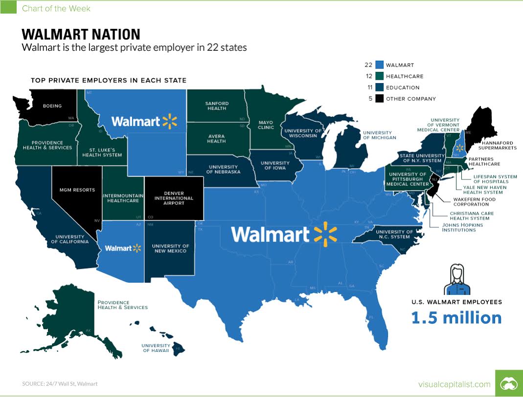
 This map simply blows my mind: think about what this means for wages nationwide… Source: Visual Capitalist
Read More
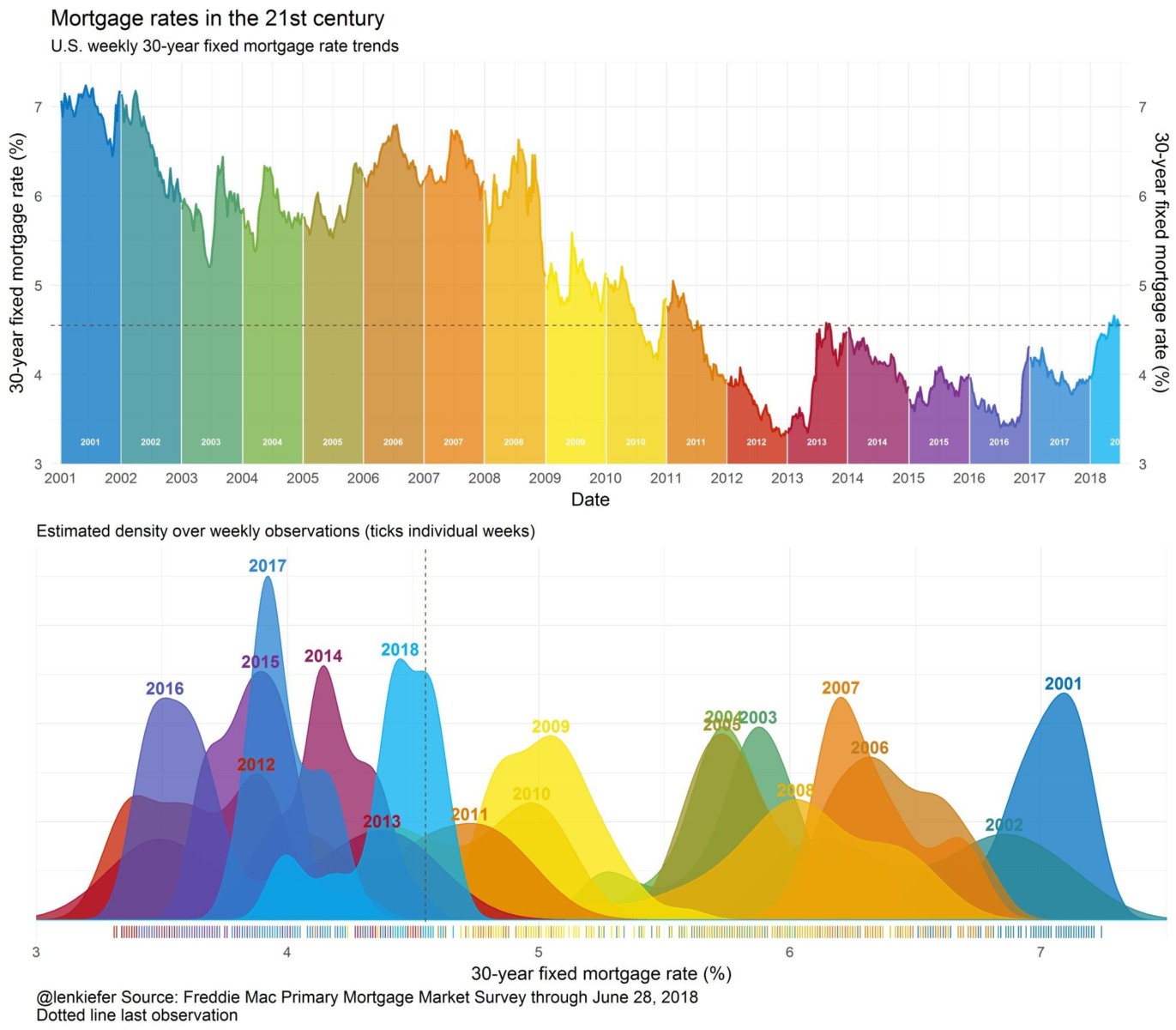
 Via Jonathan Miller (Miller Samuel) comes this wonderful chart of mortgage rates per year since 2000: click for ginormous graphic...
Read More
2 Centuries of U.S. Immigration From 1920 to 2013, 79 million people obtained lawful permanent resident status in the United States. This...
Read More
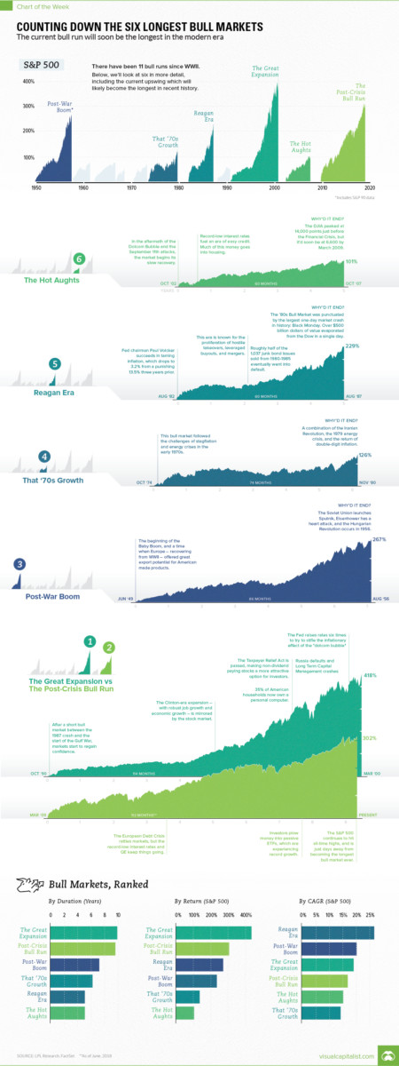
 I have modest disagreements about start and stop dates but overall this is an intriguing set of graphics: Source: Visual Capitalist
Read More
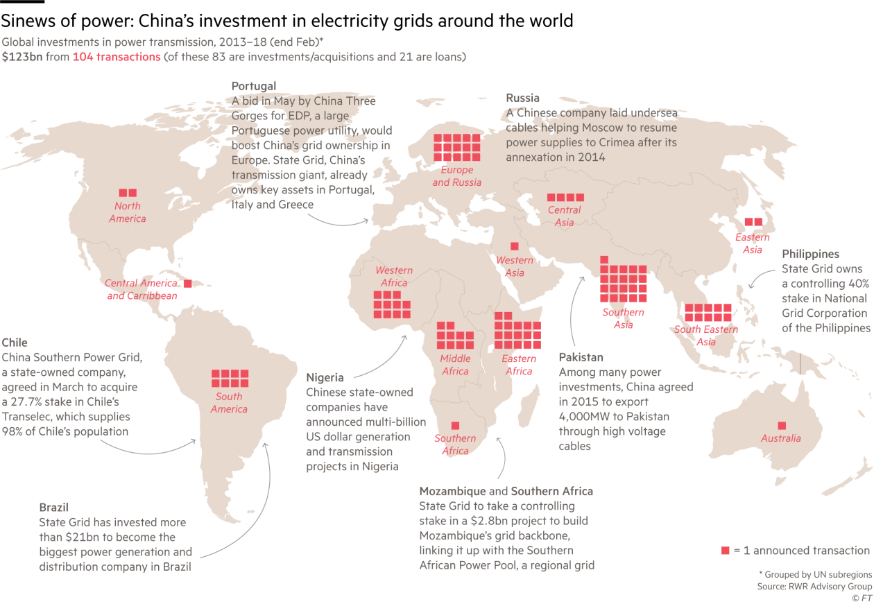
 click for ginormous graphic Source: Financial Times FT: “All of this fits in with Beijing’s goals of expansion and being a...
Read More
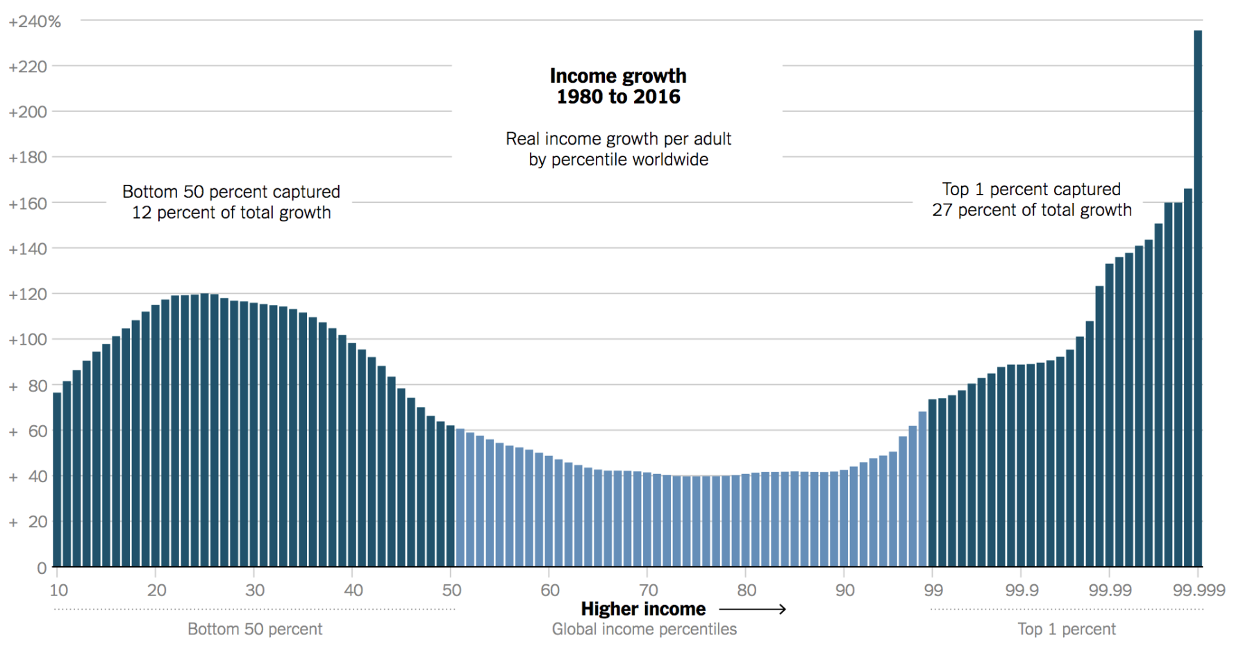
 Source: New York Times While researching No, Your iPhone Does Not Make You Wealthy, I found this really interesting chart (above)....
Read More
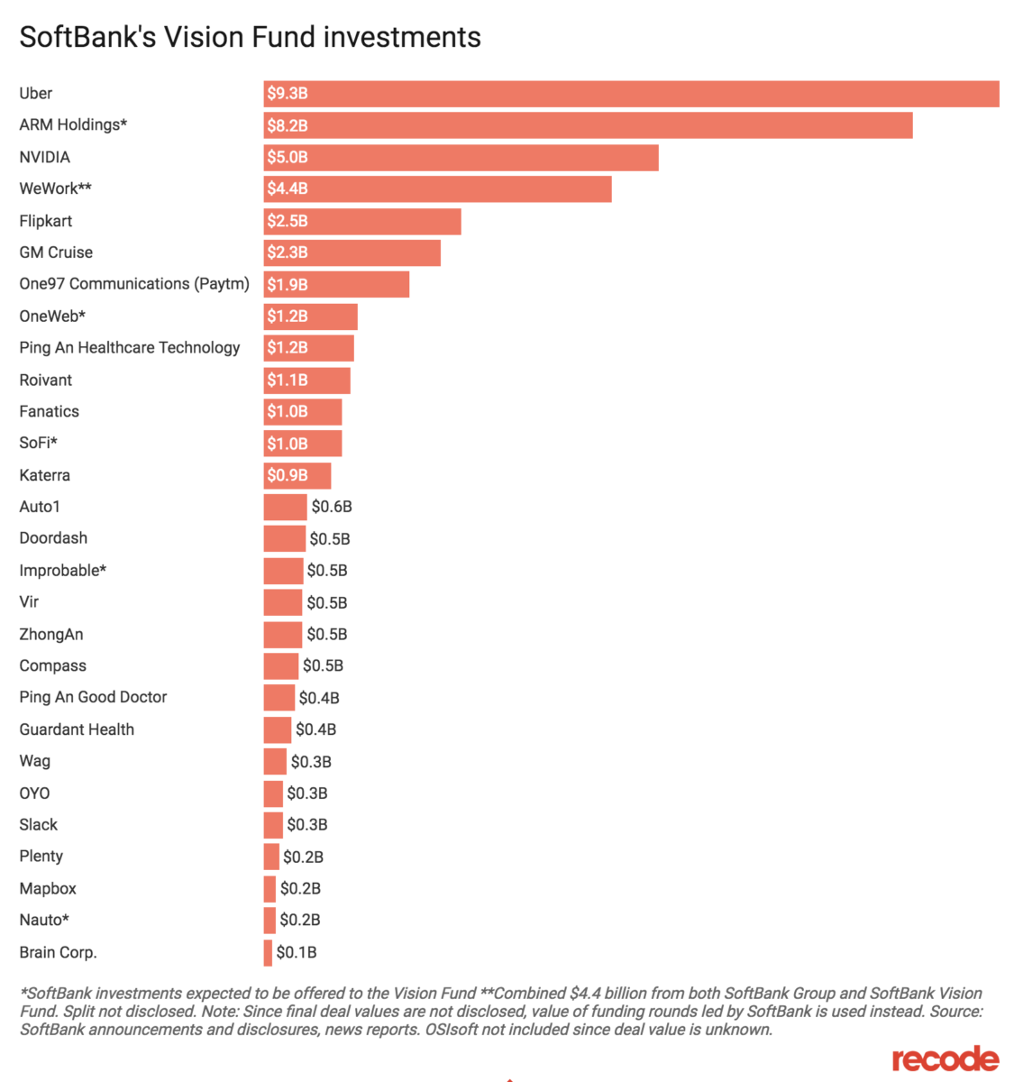
 A few weeks ago, SoftBank’s mammoth Vision Fund came up in my MIB conversation with Steve Murray of Revolution Growth. At $100 billion...
Read More
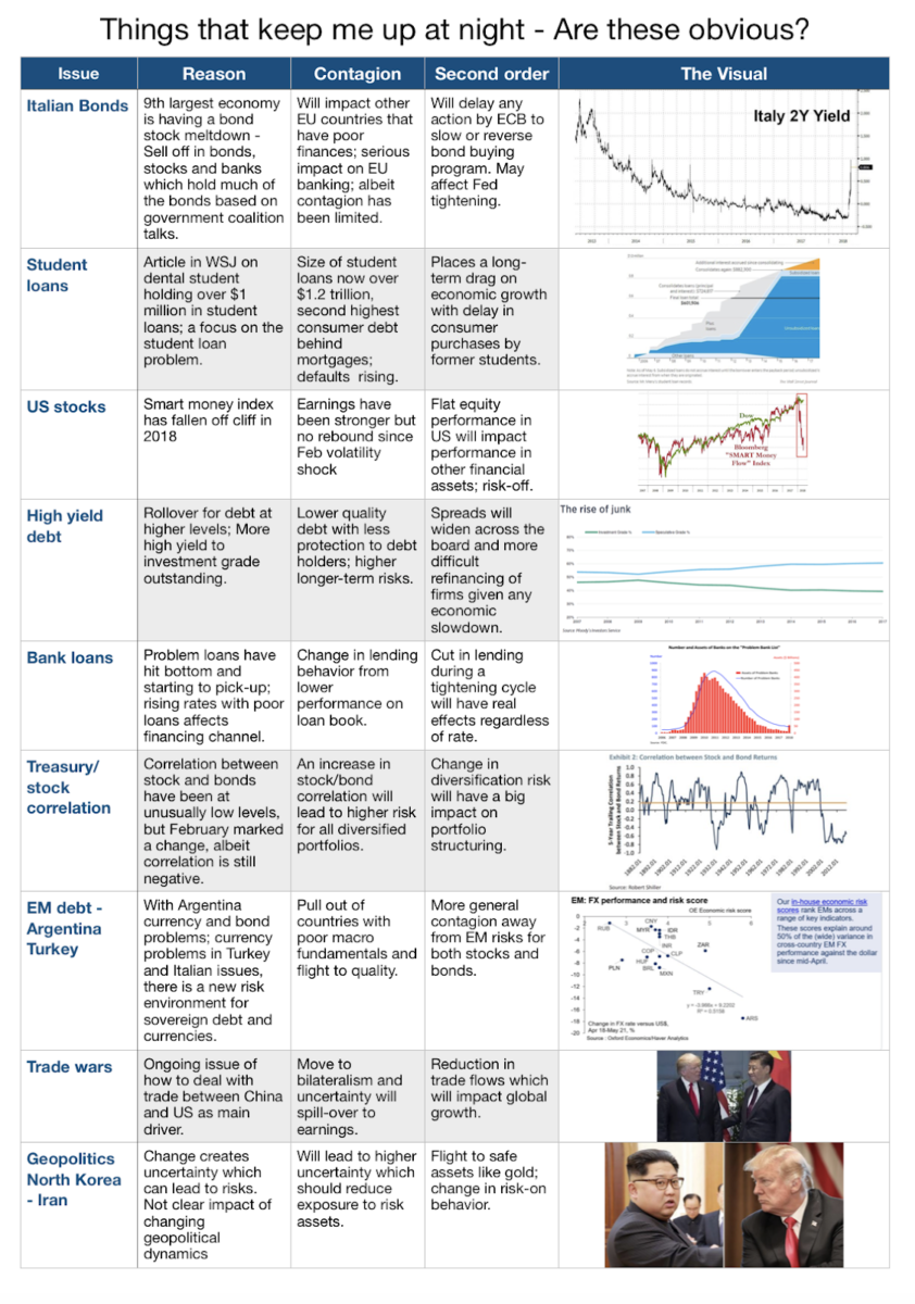
 Via Mark Rzepczynski, we get a brilliant reminder that the issues concerning most investors are for the most part, not surprises to Mr....
Read More
 I am all about employment and wages this week: click for ginormous graphic Source: How Much These are the top ten countries...
 I am all about employment and wages this week: click for ginormous graphic Source: How Much These are the top ten countries...

