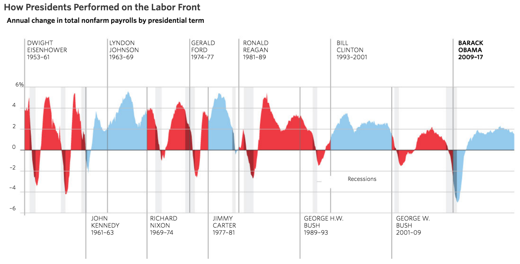
 Interesting data analysis from the Wall Street Journal. This is interesting, despite the obvious flaw of giving too much credit and...
Read More
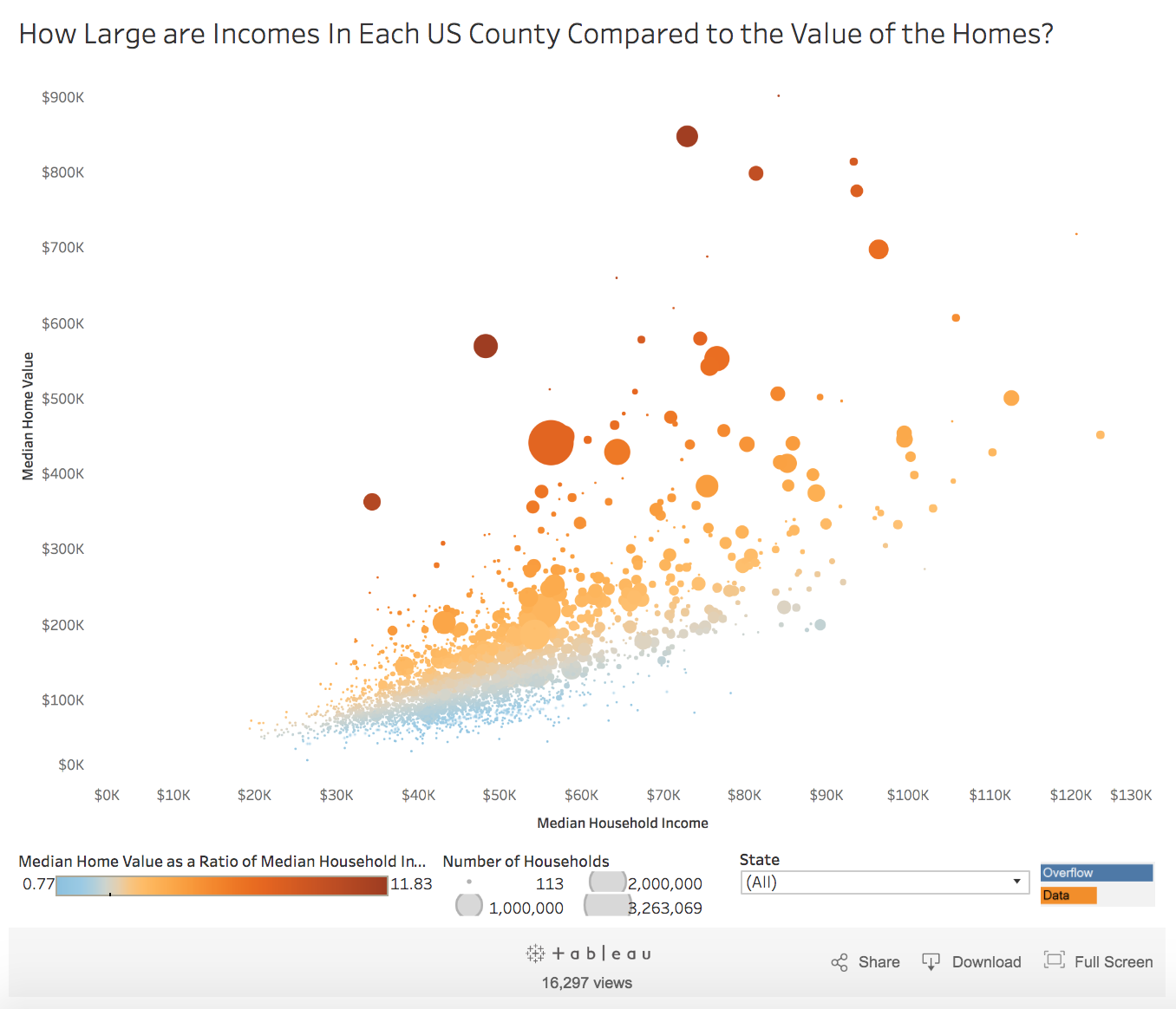 This is a very interesting chart: How Large are Incomes In Each US County Compared to the Value of the Homes? Click for...
Read More
 Real Time Economics chart of various asset class performance for 2016 is the coolest thing you are likely to see today: Source:...
Read More
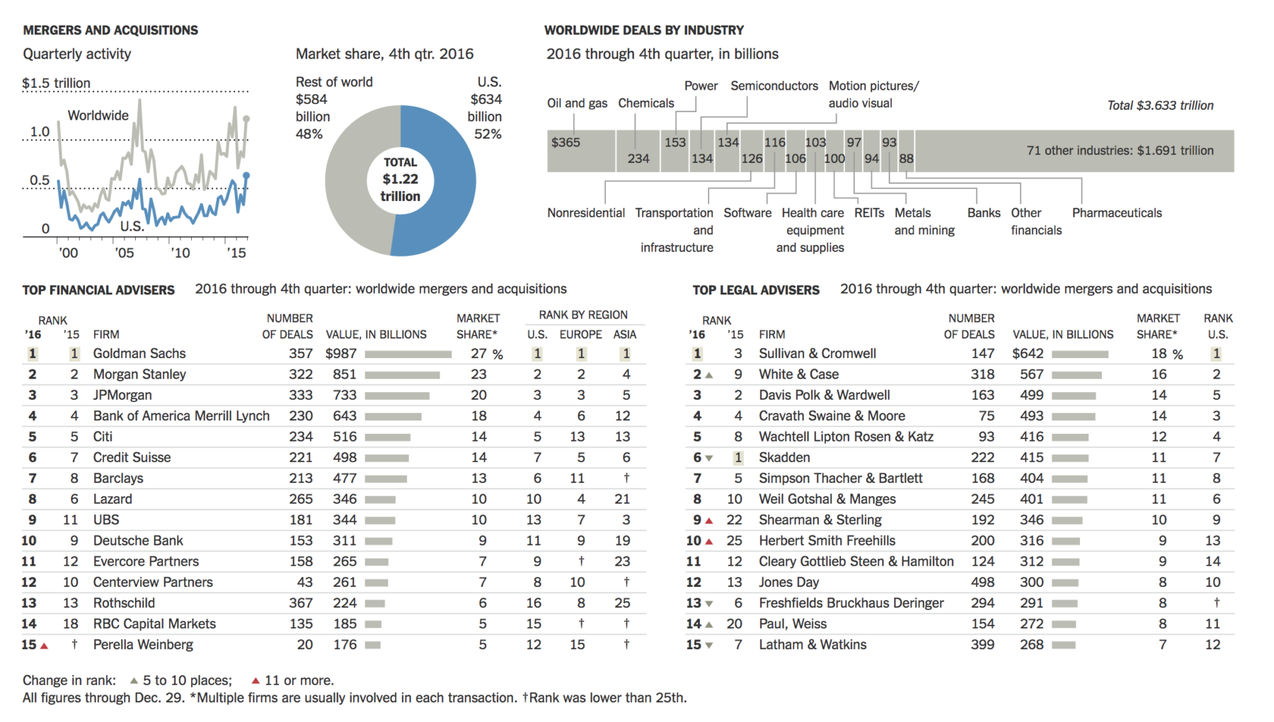 Companies announced $3.6 trillion worth of deals in 2016, a decline of 16.6 percent from the previous year. It was the third biggest year...
Read More
 This is spectacular: Click for ginormous set of interactive graphics Source: Bloomberg Graphics
Read More
 Posted without comment: Source: BoingBoing
Read More
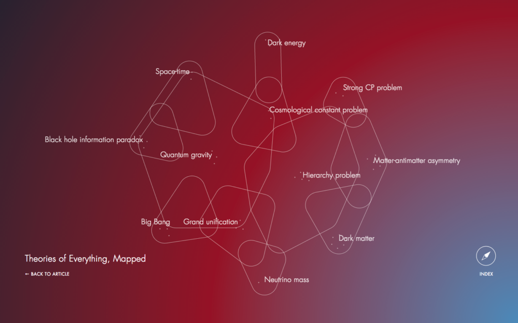 A very cool deep dive into the competing theories of cosmology, including the interrelationships between some of the abstract parts of...
Read More
 ABC Source: Compound Interest
 Interesting data analysis from the Wall Street Journal. This is interesting, despite the obvious flaw of giving too much credit and...
 This is a very interesting chart: How Large are Incomes In Each US County Compared to the Value of the Homes? Click for...
 Real Time Economics chart of various asset class performance for 2016 is the coolest thing you are likely to see today: Source:...
 Companies announced $3.6 trillion worth of deals in 2016, a decline of 16.6 percent from the previous year. It was the third biggest year...
 A very cool deep dive into the competing theories of cosmology, including the interrelationships between some of the abstract parts of...

