 Light posting this weekend, but I came across two fascinating VIX graphs that demanded discussion. The VIX, for those of you who may not...
Read More
 As promised, today brings us to the 4th in our series of charts: P/E vs S&P500 click for larger chart courtesy of Mike Panzner, Rabo...
Read More
 A reader asked about prior studies on a flattening or inverting yield curve, wondering "what have they concluded?" Quite...
Read More
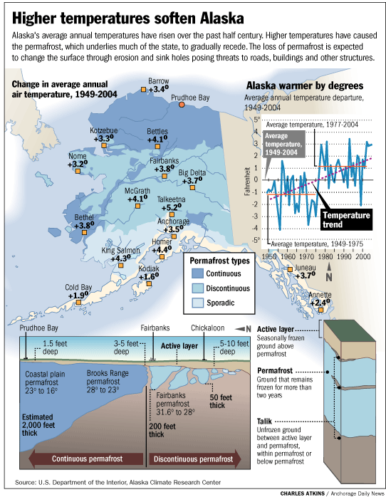
 It seems that the melting polar ice is becoming more of a concern to Alaskans than those of us in the lower 48. click for larger graphic...
Read More
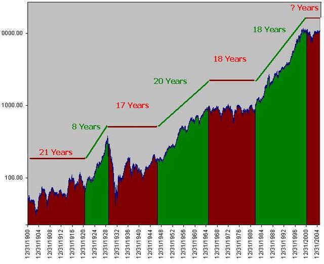
 Have a look at this 100 year (actually, 105-Year) chart. I colored each “Market” appropriately — Green for Bull, and...
Read More
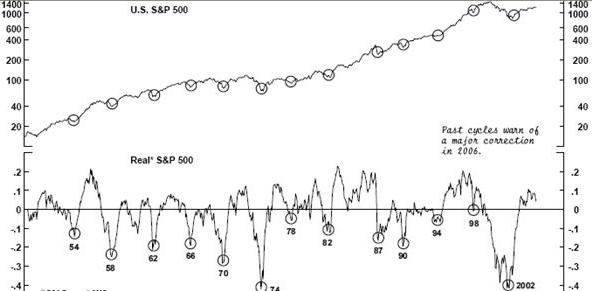
 This is the first of 4 charts I plan on revealing this week. Each one will hopefully shed some insight into what we may expect in 2006....
Read More
The yield curve, as measured by the ratio between the 10 and 2 year treasuries, is merely a few ticks away from inverting. This is...
Read More
 After an involuntary 24 hour blogging hiatus, and after a fast skim, not much calling out to me in Barron’s or WSJ, I felt the NEED...
Read More
 Global Warming is actually misnamed — it should be called Global Weather Volatility. Because of gulfstreams, ocean currents, etc.,...
Read More
 I haven’t written about Gold much recently, which I have been Bullish on for quite some time. (I actually wrote a positive report...
Read More
 Light posting this weekend, but I came across two fascinating VIX graphs that demanded discussion. The VIX, for those of you who may not...
 Light posting this weekend, but I came across two fascinating VIX graphs that demanded discussion. The VIX, for those of you who may not...


