
Salil Mehta is a two-time Administration executive, leading Treasury/TARP’s analytics team, as well as PBGC’s policy, research, and analysis, as well as their first risk analysis function. Salil is the creator of one of the most popular free statistics blogs, Statistical Ideas.
~~~
This weekend many in the financial media will focus on only the January stock market results just now concluded. Unfortunately, the results continue to catch many off-guard. Some as well will contrast it to the stock market decrease from August 2015. Both were difficult times around the world, of course, particularly in the context of the past year. But not all market crashes can be analyzed using similar time frames. And what we’ll show below is the current stock market drop didn’t start on January 1, but instead two months ago on December 1! While likely, we also don’t have conclusive evidence that this drop is over yet, but any analysis of the current market nonetheless would need to analytically consider it from a multi-month perspective, and just not one that started with the New Year. If you were managing your investments, then you would have wanted to be aware of the current extreme risk back in early December (when incidentally we precisely admonished readers with these fitting articles here, here). And you would have wanted to know what similar tools exist to manage such risk, both now as well as during the fierce 7-day bloodbath surrounding China’s Black Monday in August.
In the chart below we show the market levels since mid-April 2015, statistically carving out two definite market risk periods. The first risk period was a severe 7 days in August (August 19, through August 27), which captures the most intense part of that global beating. The second risk period is the currently running on 41 days (December 1, through January 29).
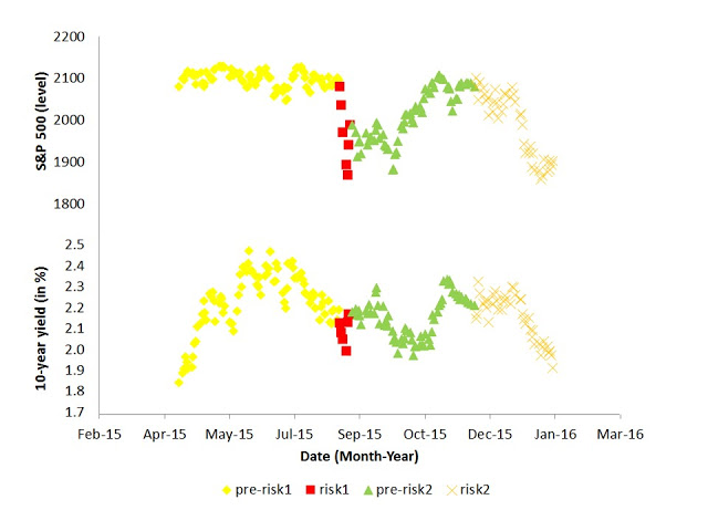
We show, in the table below, the basic characteristics of these four time clusters we colored above. It includes data for both the S&P 500, as well as the 10-year treasury market, and includes updated results throughout the day for January 29.
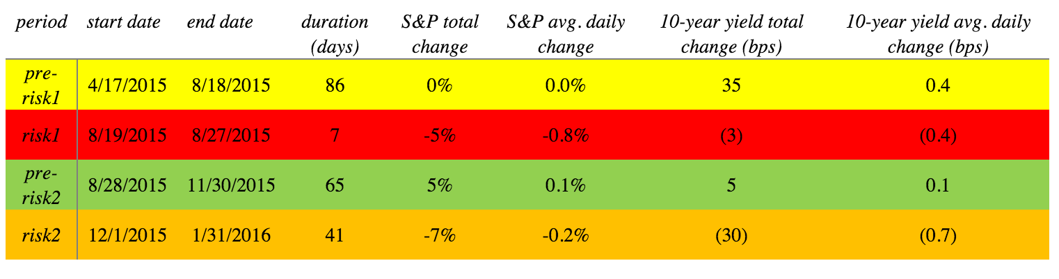
While the current market turmoil -beginning in early December- was more gradual to unravel than was the price dump in August, the total brutality to one’s portfolio could have been similar. Over the December-January 2-month period, the markets we see fell 7%. December contributed 2 percentage points of this 7% total drop, though December was just as chaotic as January. It probabilistically emulates January more so than the ~3 month silky ascent shown in the green pre-risk2 period above (when the market smoothly rose 5% in total). And during just 7 days in August (1/6 the time of the current 2-month drop), we see the markets fell 5% (just less than the loss that took 2-months through January 2016).
It’s also worth making comments about extreme-risk days. Of the 8 worst trading days in the past year (where the markets fell in excess of 2.1%), 6 of them were in the 2 risk periods we pinpointed here. And these 6 worst loss days were evenly split between risk1 (in August) and risk2 (December-January). Incidentally, the 10th worst market day was still within risk2 (on December 11).
These two market risk periods also showed up in the treasury markets. We see that the risk periods, especially the recent two months, saw a large and quick drop in the 10-year yield. This is despite the Federal Reserve’s rate hike from 2.3%, on December 16! Additionally over the past year, the 10-year yield had peaked at 2.48%, in June 2015. Since then, the market has closed below 2% on eight occasions, so far. Once was during risk1 (the August slump), and five times during risk2 (the past two months), including at the post-June lows of ~1.9% today! On any given day, one was ~5 times more likely to see the yield drop below 2% in the “risk” zone then in a “pre-risk” zone. While professionals rationalized a 2016 rate rise from the 2.3% level, while it seemed incredulous at the time, we explicitly calculated in the link about that in fact this low level on the 10-year yield would have a reasonable chance of occurring.
The reason it is important to recognize December as the market drop inception is it allows one to better understand when along the way they should have been cognizant to the overall market concerns that are about to unfold (here, here, here). Instead of over-guessing around various central bank, or consumer retail activity. Or even worse, relying on when Wall Street strategists tell you there is a problem. They can’t be expected to know. As risk2 was unfolding in December, theyALL again put out a bland 8% market rise forecast and multiple rate-hike forecast. Yet the floor was falling under their feet as they spoke. This is similar to all of the weather “meteorologists” tell you on television in the morning that it will be sunny that day; meanwhile there is a downpour outside as they speak.

Our recent piercing analysis was the premise of a cover news story (and the most read) in MarketWatch -former Wall Street Journal media company- earlier this month. In addition to whirling among multiple other news media worldwide, and topping adazzling 125,000 reads. And sure, once again all the strategists give some sort of lip service about risk as well, but it’s ambiguous what it means to them.
 Only after getting blind-sided with a double-heaping of risk in January, even the already “most conservative” forecaster threw in his towel for the markets this year. One would think the others are concerned about their reputations having regrettably, insanelybullish “forecasts” year-after-year. But according to the most recent Barron’s cover story it doesn’t seem so. Having an amusing time selling you on an 8% rise in a stock market view, and instead you got stuck right-away with a tragic 7% drubbing. Who is going to make up this appalling 15% difference… and that’s just this year’s “forecasting” error. For $1 million retirement saved in stocks, that’s a $150,000 after-tax flaw.
In early January it was interesting to see that those in the industry and in the media w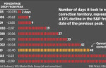 ho look at market statistics focus on the duration of any correction. But even these counsel came nowhere close to teasing out the relevant probability conclusion that was obvious to our blog readers, even then, about what the duration implies about a further market destruction later in January.
In this Wall Street Journal graphic for example, the story shouldn’t be about regurgitating a single-dimensional fact concerning the November 3 duration. There is a critical probability connection between that data, and the damage we conclusively experienced in the bottom two peaks highlighted in green (May 2015, and April 2011). We noted it at the time, and in this case there was still some days to go, if armed with proper market intelligence, before the market’s recent nadir on January 20.
In summary, we see that the two market risks of the past year have some characteristics in common and also not in common with one another. Studying them together, including starting the current market slide analysis on December 1, is mandatory for the storyline. We should also remind readers that there are statistical aberrations to the smoother market behavior in-between these crashes (known here in the article as merely pre-risk periods!) And of equal attraction to should-be leery market watchers, it’s not obvious if the current market malaise has for now subsided.
This market turbulence starting in December 1 reveals not the same concentration of deep cuts that we got in August, yet a clearly delivers to an unknowing investor a certain misery from a thousand paper cuts. The typical daily gyration of the markets (compressed into a frightening 7-day panic in August) were twice as high as they are in the past 2 months! Yet fear revealed itself more so in other ways in the past 2 months, such as with extreme moves in hedges. While an out-of-the-money put option would have worked well in August, it would have been more costly to employ over the past two months.
Between these two risk periods (risk1, and risk2) that we discuss in the article, was the difference a matter of the market working more orderly this go around? Or was it that crashes are always somewhat random in how they unfold (but for a small number of common dimensions that everyone should understand)? The research links above help answer this, with a bias towards the more mathematically difficult but more unconventional and more factual explanation. But in our research we use most of U.S. market history, as an illuminative beacon to guide us.
Source: Statistical Ideas
