Small World: On Saturday, I mentioned problems with Citibank’s Panic/Euphoria sentiment measure.
Then, I discussed the work of James Montier of Dresdner Kleinwort Wasserstein (DrKW) yesterday, (Seven Sins of Fund Management). This was the first time I ever mentioned him.
By coincidence, I read about a Fear/Greed indicator last night from the very same James Montier in Thoughts from the Frontline (which coincidentally references my earlier discussion of Northern Trust’s Paul Kasriel). How’s that for convoluted circles?
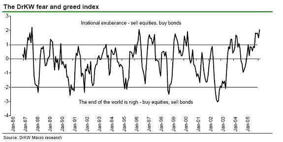
Anyway, here we are less than 2.4% from recent highs, and Montier’s sentiment readings does not shows panic (like Citi’s Lefkovich’s does) — but rather, reveals irrational exuberance: The index has only reached
this level of greed in September of 1987 and May of 1996.
>
DrKW Fear and Greed Index
click for larger graph

Source: Thoughts from the Frontline
>
Montier notes this is a measure of Risk appetite:
“It is really a measure of relative risk
adjusted momentum between global equities and bonds. When the risk adjusted
performance of equities is high relative to the risk adjusted performance of
bonds, then investors start to forget about the concept of risk altogether; they
become totally focused on return. Irrational exuberance reigns (shown as a
reading of above 1 in the chart below).”“In contrast, when bonds have performed well in risk adjusted terms relative to
equities, investors tend to forget that things will generally get better at some
point, so this creates the ‘end of the world is nigh’ kind of feeling (a reading
of -2 in the chart below). Effectively, the measure captures the tendency
towards extrapolation of the recent past/current situation into the indefinite
future. Thus it serves as a contrary indicator.”
John Mauldin adds that in 1996, the DrKW Fear/Greed indicator went off the charts — but the markets were still going up:
“So why even bring it up? Because we have other flashing lights going off in our list of indicators. As we discussed for the last two weeks, real hourly earnings and real consumer spending are slowing down, which is a very good indicator of a future slowing of the US economy. And the yield curve is starting to invert (more later). We are getting signals that should make investors more cautious, yet they are becoming even less so!
Neither consumer spending nor the yield curve were showing “issues” in 1996. On balance, greed was a good thing back then.”
John does mention that the Fear & Greed Index “seems to nail the bottoms, but we are nowhere near a bottom.”
All ths raises one question: if there were no confirming signals in the 1996 DrKW’s indicator highs, what other confirms were there in 1987? I asked John, and will update this post as soon as I hear back from him.
>
>
Source:
Greed by Four Lengths
John Mauldin
Thoughts from the Frontline, February 10, 2006
http://www.frontlinethoughts.com/article.asp?id=mwo021006


Another interesting study of topping processes has been done by Paul Desmond of Lowrys. He wrote about it in Welling/Weeden’s newsletter which can be obtained online.
He studied the Dow at 14 different tops from 1929-2000 and deduced that, at the ultimate nominal top, somewhere b/w 1.6%-10.6% of all stocks were making new highs along with the Dow itself.
At the Sept 3 1929 top, only 2.6% of NYSE stocks made a high–all of 18 stocks. Many Dow components were actually 15-20% off their highs even as the Dow itself was going higher—sorta like right now.
At the recent Dow high in Jan 2006, only 9 Dow components were within 1% of their highs. If the Dow continues to inch higher, watch for fewer and fewer Dow and NYSE stocks to make new highs.
Lowry says that, based on history, the market should make a top within the next “several” months. He expects fewer and fewer stocks to participate, though he says that midcaps have the best chance to outperform. He also expects a 20% decline to follow, maybe more.
Of course, if we start seeing more stocks making new highs, then this theory is trashcan-bound.
I read the study last week, spoke to Desmond about it yesterday (real nice guy)
Today, I’m interviewing him for a Street.com column on is study.
Should be out sometime after that.
Barry,
Sites such as Stockcharts at http://stockcharts.com/candleglance/?$NYAD,$NYHL,$NAAD,$NAHL,$AMAD,$AMHL only show a differential between new highs and new lows; sites such as Marketgauge at http://tal.marketgauge.com/dvMGPro/Charts/Charts.asp?chart=NYHILO only show a ratio between new highs and new lows. Neither would be directly helpful in tracking Mr. Desmond’s indicator.
What is an example of a site that has a free chart of new highs as a percentage of all stocks for a given stock exchange?
With best regards.