Fascinating set of charts from Jameyer’s Flickr stream:
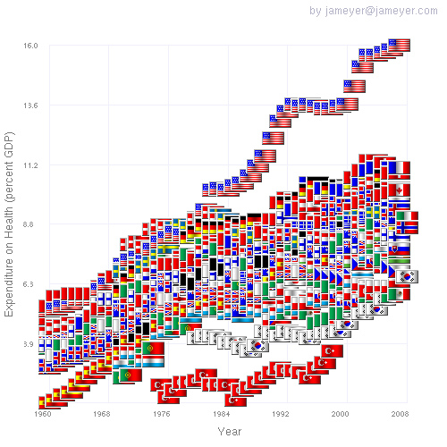
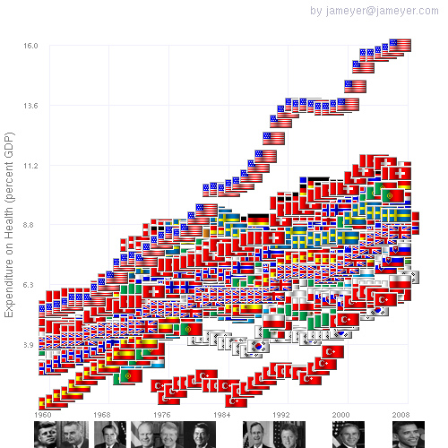
The US sprung ahead of other OECD nations in the 1980s. Costs were flat for around 8 years in the 1990s and then took a big jump just after 2000
Health Care Costs as percent of GDP vs Year

Health care costs vs year for OECD countries. The US has run-away costs starting in 1980.
~~~
Health Care Costs as a percent of GDP vs Year with US Presidential Terms
~~~
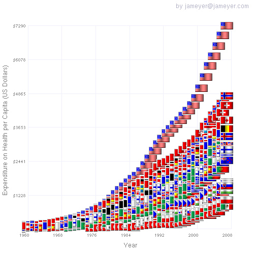
Health Care Costs: 1950-2010
See also The Incidental Economist
>
Hat tip Marginal Revolution


What's been said:
Discussions found on the web: