Speculative momentum investors continue to whistle past the graveyard of a stalled-out economic recovery
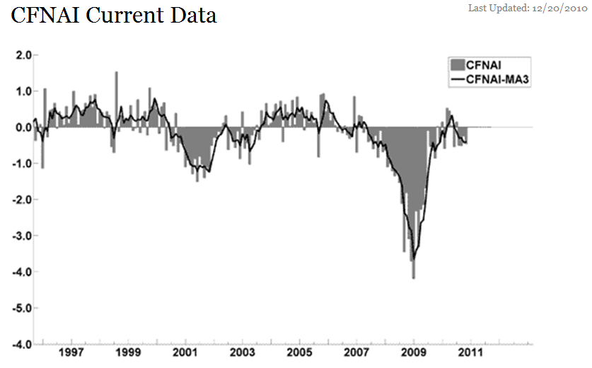
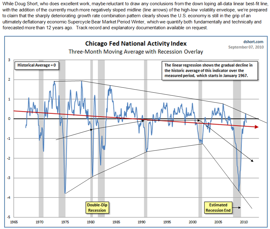
The headline on the Chicago National Activity Index (CFNAI) a composite measure that closely tracks real U.S. GDP – thus it is a coincident economic indicator – came in at -0.46 (consensus was 0.00) and the prior monthly reading was at -0.25.
The index is now down four months in a row, something not seen since mid-2009 when the U.S. economy was hitting the recession’s depth. On a three-month basis, the more “smoothed” index remains at -0.4 for the past two months (-0.41 in November and -0.42 in October).
This has now been negative since May, portraying a pace of economic activity that is well below potential and therefore continues to be consistent with both (a) a continuing ultimately deflationary economic Supercycle Bear Market Period, or Winter, and (b) our working model for after-shock, double double-dip business cycle contractions over the next four years.
Further below is a Nov update of the Conference Board’s monthly coincident economic indicator index (CEI), especially on per capita basis (red line). It tells the same story with the economic recovery having stalled out in May and flat lining since then. Notice that the modest bounce since Sep is already starting to roll over – and below the May high.
The speculatively-extended stock market and its positive wealth effect on the pickup in investor class consumer spending has been overhyped: it has briefly extended, but not reaccelerated the stalled out recovery.
The change the size of the chart picture, click on any one of the corners and drag the corresponding circle.
Below is the Nov update of the Conference Board’s monthly coincident economic indicator index (CEI), especially on per capita basis (red line). See the explanatory Nov 23 email at the bottom here. It tells the same story as the CFNAI with the economic recovery having stalled out in May and broadly flat lining since then. Notice that the modest bounce since Sep is already slowing down and starting to roll over – and below the May high. The speculatively extended stock market and its positive wealth effect on investor class consumer spending has been overhyped: it is not reaccelerating the stalled out recovery.
The grey line is the labor force participation rate, which has both bearish Supercycle and shorter term economic timing is illustrated and explained in our Nov 5 email to you, which is copied in below the chart.
The change the size of the chart picture, click on any one of the corners and drag the corresponding circle.
The Labor Force Participation rate continues to reflect the ongoing Supercycle Winter, the major double-dip recession since late ’07 and the incipient double double-dip business cycle contraction
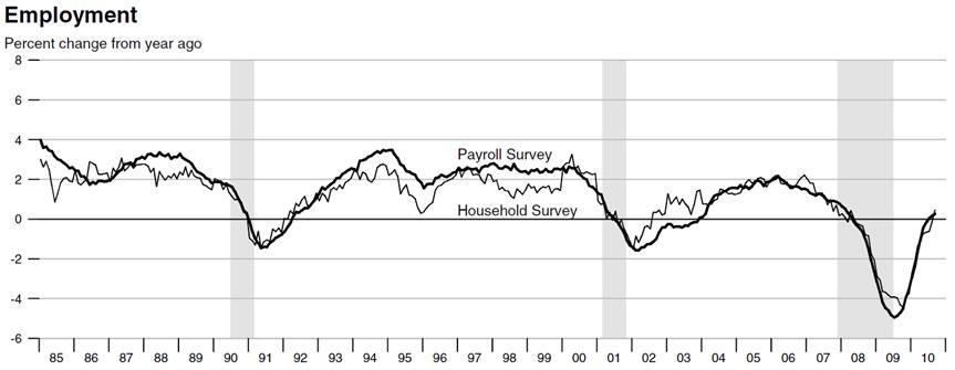
The Labor Force Participation (LFP rate, or ratio) is a coincident indicator, since both the numerator and denominator are coincident economic indicators themselves. The numerator is the number of employed (from the more comprehensive Household Survey – not just the Establishment Survey (the so-called Payroll Report), which tracks large businesses only, excluding the huge number of self-employed businesses – see their overlay comparison in second chart below). The denominator is the number of people in the labor force (non-institutional civilians age 16 and over).
Note from the first chart below that although the NBER-designated recession ended 17 months ago, the LFP has continued to decline to new lows. This supports my thesis of an ongoing major double-dip recession for the past 36 months since late 2007, at least in employment (also in auto/manufacturing sales and real disposable income. Also this is consistent with the incipient first of after-shock, double double-dip business cycle contractions. Finally, note that the LFP is also a very important coincident Supercycle Period indicator (like corporate profit margins and industrial capacity): see the up-trending arrow ending in Mar ’00 and the down-trending arrow declining since then.
Of course, TV-talking heads don’t discuss this bearish indicator, but serious, unbiased economists do.
These charts are from the Federal Reserve of St. Louis’ November issue of their National Economic Trends publication.
Here are two things the Bureau of Labor Statistics reported this morning that the TV-talking heads didn’t discuss since these important facts do not serve their permabull/new bull agenda and/or their unsophisticated analysis of the employment situation:
IMAGES
IMAGES
Coincident economic indicators are consistent with our after-shock, double double-dip business cycle expectations
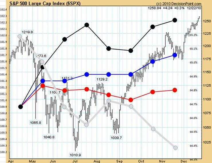
The chart below illustrates how the stock market reflects the stalled out economic recovery as reflected by The Conference Board’s (CB) Coincident Economic Indicator Index (CEI).
The CEI is a composite of four component indicators that are used by the National Bureau of Economic Research (NBER) to track the business cycle covering; employment (the most important); production; income and sales as explained here:
http://www.conference-board.org/pdf_free/economics/bci/earI2.pdf
Since economists, especially by those that specialize in international business economics, know that an economy that is not growing faster than its population or labor force is not growing, it’s very important to that into account even though for “political” reasons the CB, and NBER do not report that consideration, and thus the financial media do not either. It can be well argued that that the collective wisdom of the capital markets understand this.
For example, when the CEI (blue dotted line) is adjusted for growth in population (red dotted line) or the labor force (black dotted line), the stock market’s failure to sustainably break out above its Apr 26 high in the S&P 500 index (SPX) at 1220 is understandable, as it has been predictable by our business cycle model explained our email to you four days ago (copied in below).
The change the size of the chart picture, click on any one of the corners and drag the corresponding circle.


