I have lots of charts to back up the specifics of today’s WP column, but unfortunately, we could not jam them all into the paper.
This run is a supplement to that column.
click on any graphic for a larger chart
1) The housing boom and bust was global

Source: McKinsey Quarterly
~~~
2) Nonbank mortgage underwriting exploded from 2001 to 2007, along with the private label securitization market, which eclipsed Fannie and Freddie during the boom
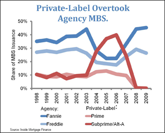
Source: University of North Carolina at Chapel Hill
~~~
3) Subprime Lenders were (Primarily) Private: Only one of the top 25 subprime lenders in 2006 was directly subject to the housing laws overseen by either Fannie Mae, Freddie Mac or the Community Reinvestment Act
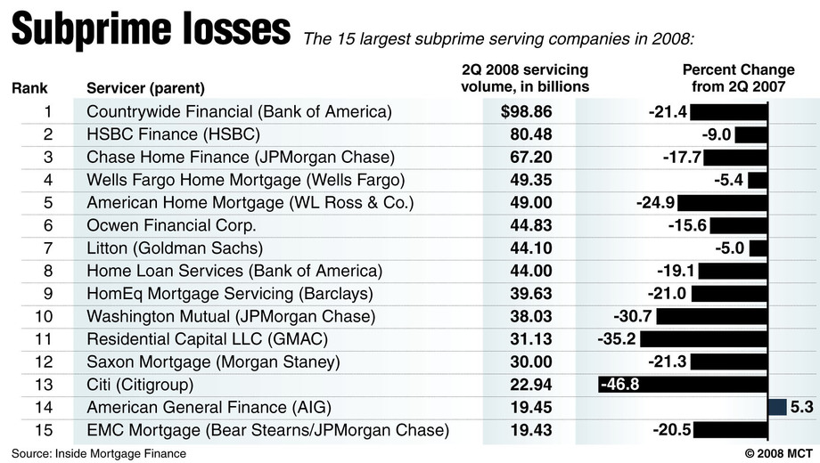
Source: McClatchy
~~~
4) Lenders made 12 million subprime mortgages with a value of nearly $2 trillion. Mortgage Companies and Thrifts NOT affiliated with CRA made 75% of Subprime Loans from 2004-07,
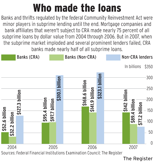
Source: Orange County Register
~~~
5) Fannie and Freddie risky loan purchases was dwarfed by Private Label Securitization
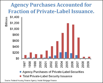
Source: University of North Carolina at Chapel Hill
~~~
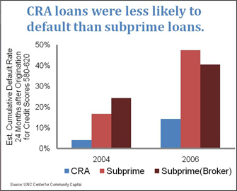
6) CRA were less likely to default than Subprime Mortgages
Source: University of North Carolina at Chapel Hill
~~~
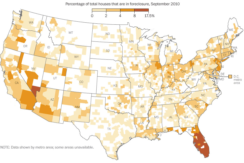
7) Suburbs and Exurbs were where the boom & bust occurred — not the CRA regions
Source: Washington Post


What's been said:
Discussions found on the web: