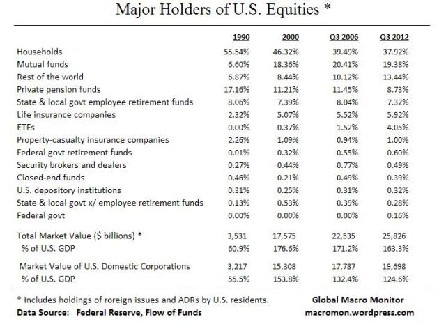
Here’s an update and upgrade to our mid-2011 post.
Lots of noise and imperfections in the Fed’s Flow of Funds data but sure beats the alternative – nothing. The biggest caveat, in our opinion, is the data include holdings of foreign equities by U.S. residents so not a concise measure on how the U.S. stock market is allocated. Also note the household sector includes hedge funds and IRAs.
The table below illustrates a large decline in the percentage of the equity market allocated to private pension funds. No doubt there’s noise here and it may also be partially explained by demographics but the decline over the past twenty years is glaring.
The data also show the growth of mutual funds and ETFs since 1990 as households have reduced holdings of individual stocks and increased allocation into these sectors.
 (click here if chart and tables are not observable)


What's been said:
Discussions found on the web: