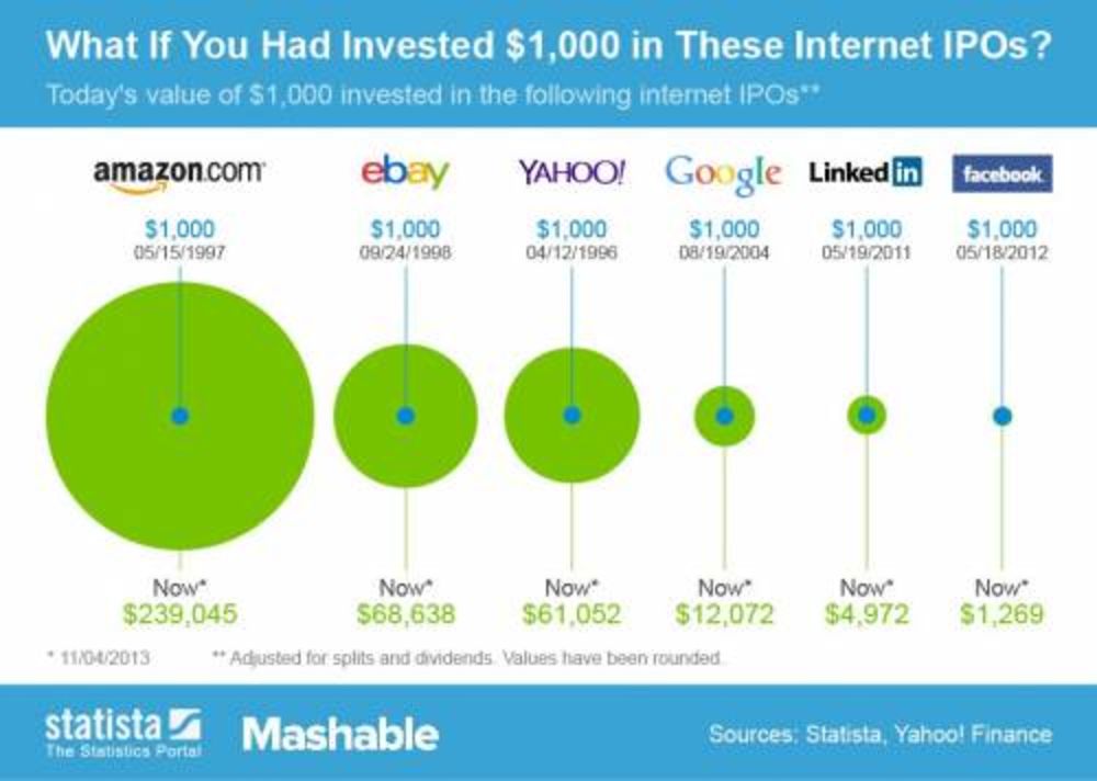
Ritholtz Chart: The Worst Twitter Graphic Yet: Ritholtz Chart
Please, when describing the process of going public, do not hand-select the best tech IPOs of the past 20 years to use as proof of how awesome all tech IPOs themselves are.
Bloomberg, November 7, 2013

Source: MSN
No, no, no, no, and one last no.
Look, I get it, I really do: You are all excited — dare I say “atwitter”? — at the prospects of today’s big initial public offering. It is oversubscribed by 30X (or so we hear), priced at the high end of its range, and opened way above $40, and is trading at $45.
But please, when describing the process of going public, do not hand-select the best tech IPOs of the past 20 years to use as proof of how awesome all tech IPOs themselves are.
I like Twitter, as you can see @Ritholtz. I use it much more than I ever did Facebook (I was very negative about its IPO). I am more constructive about Twitter’s IPO relative to its initial price, assuming you can even get any. However, I cannot condone the use of horrific infographics like the one above. It has so many biases reflected in it that it has to be is our “Bad Math/Cognitive Bias” teachable moment of the day.
Consider:
1) Hindsight Bias: These are the IPOs that did well — but did anyone know beforehand that LinkedIn and Amazon were going to be giant winners? No.
2) Confirmation Bias: Since we are talking about a hot IPO, then let’s show only all really successful IPOs of the past few years. What does this mean relative to TWTR? As it turns out, absolutely nothing.
3) Winner’s Curse: The most optimistic bidders are the ones who drive typical IPO prices. This may be the reason that studies have shown IPOs underperform the broader market in general. According to Professor Jay Ritter of the University of Florida, from 1970 to 2010, the average IPO did worse than the market over their first few years by a little as 140 basis points and as much as 810 basis points.
4) Survivorship Bias: These are the winners, where are the losers? Where are Pets.com, Webvans, eToys? Ignoring those firms that die is a fundamental failure for any stock analyst.
5) Time Error: Amazon has been trading for 16 years; Facebook for a little over 1 year. To put the above returns into any sort of usable context, they should be converted into annualized returns — not cumulative gains.
I am thrilled for Twitter’s successful IPO, and I hope the company survives a long time. That graphic, however, tells us less than nothing — it is actively misleading. Investors need to be wary of such foolishness.
Originally published here


What's been said:
Discussions found on the web: