Long Term Drivers of Economic Growth & Profits
July 7, 2015 2:30pm by
This content, which contains security-related opinions and/or information, is provided for informational purposes only and should not be relied upon in any manner as professional advice, or an endorsement of any practices, products or services. There can be no guarantees or assurances that the views expressed here will be applicable for any particular facts or circumstances, and should not be relied upon in any manner. You should consult your own advisers as to legal, business, tax, and other related matters concerning any investment. The commentary in this “post” (including any related blog, podcasts, videos, and social media) reflects the personal opinions, viewpoints, and analyses of the Ritholtz Wealth Management employees providing such comments, and should not be regarded the views of Ritholtz Wealth Management LLC. or its respective affiliates or as a description of advisory services provided by Ritholtz Wealth Management or performance returns of any Ritholtz Wealth Management Investments client. References to any securities or digital assets, or performance data, are for illustrative purposes only and do not constitute an investment recommendation or offer to provide investment advisory services. Charts and graphs provided within are for informational purposes solely and should not be relied upon when making any investment decision. Past performance is not indicative of future results. The content speaks only as of the date indicated. Any projections, estimates, forecasts, targets, prospects, and/or opinions expressed in these materials are subject to change without notice and may differ or be contrary to opinions expressed by others. The Compound Media, Inc., an affiliate of Ritholtz Wealth Management, receives payment from various entities for advertisements in affiliated podcasts, blogs and emails. Inclusion of such advertisements does not constitute or imply endorsement, sponsorship or recommendation thereof, or any affiliation therewith, by the Content Creator or by Ritholtz Wealth Management or any of its employees. Investments in securities involve the risk of loss. For additional advertisement disclaimers see here: https://www.ritholtzwealth.com/advertising-disclaimers Please see disclosures here: https://ritholtzwealth.com/blog-disclosures/
What's been said:
Discussions found on the web:Posted Under
Previous Post
‘Wisdom of Crowds’ is Surprisingly DumbNext Post
Best Research-Cell Efficiencies


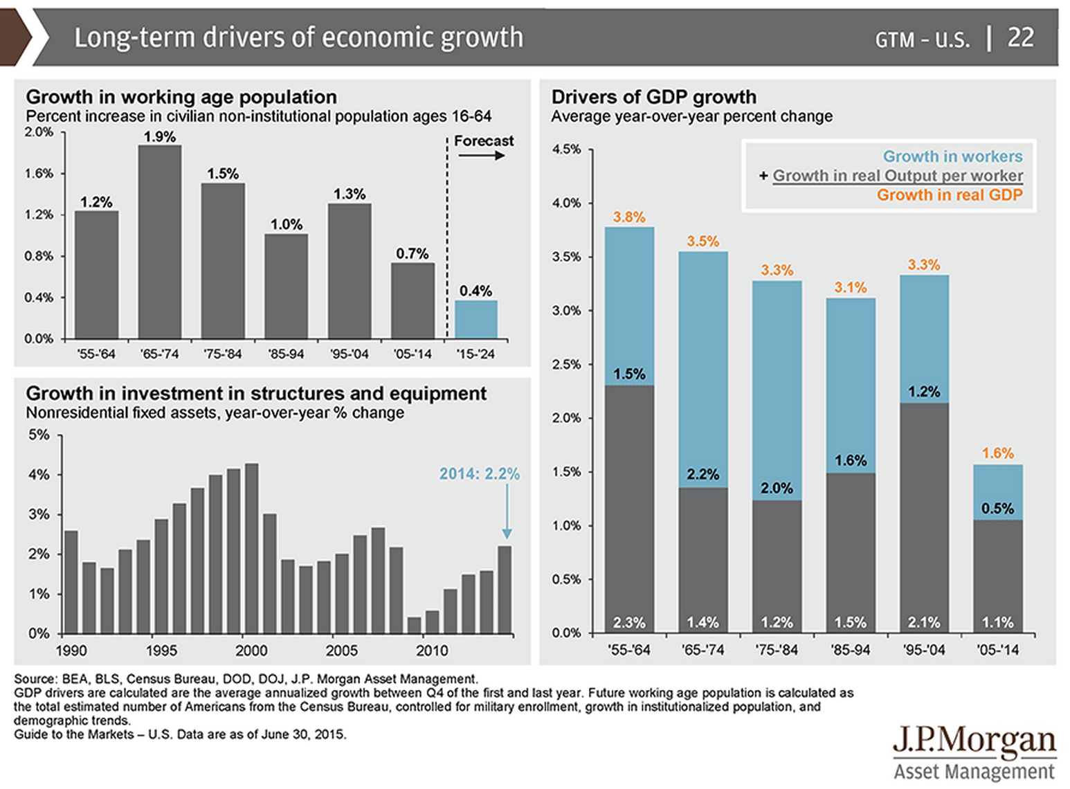
So the highest growth in output per worker was from ’55-’64 with punitively high income tax rates and the second highest growth in output per worker was ’95 – ’04 following the disastrous Bush and Clinton tax increases.
Meanwhile output per worker grew only marginally better from ’85 to ’94 following the miraculous Reagan “Morning in America” tax cuts than the Johnson-Nixon-Ford-Carter Era with new civil rights and environmental regulations piling on every year. Meanwhile real output per worker grew an abysmally low 1.1% following the Bush tax cuts from ’05-’14.
Focusing on the output per worker instead of adding in the growth in the number of workers which is a demographic thing pre-determined decades earlier, allows one to see the actual impact of the sum total of the various government and business environments during a period. I would appreciate it if somebody could explain the actual economic theory behind the Laffer Curve instead of the propaganda that clearly does not match the actual data. It appears to have the inverse results compared to what it is purported to have.
The chart “Growth in Working Age Population” shows that demographics are extremely important. The largest increase was 1965-74 – precisely when baby boomers were hitting the job market.
With the 1915-24 forecast of 0.4% growth in working age population, the economy will be really challenged to grow. Demographics helps explain why growth since the 2008-09 recession has been lower than the growth after previous recessions.
These charts should put a death nail in the Laffer Curve. That theory won’t work with decreasing numbers of working Americans.
It didn’t work when there were increasing numbers of working Americans. It just happened to coincide with the growth due to increasing numbers of workers. Correlation is not causation.
On the growth in investment chart, two questions. One, what did the investment in technological equipment, whether fixed or intellectual, up to 2000 have as an impact on growth since then? You can add in the movement to cell phones. Two since 2000 and especially 2008, how much has of that investment has gone into non productive things, the war on terrorism, and not into the physical infrastructure of the country?
To make it all a simple equation:
Annualized increase in GDP = Annualized increase in productivity + increase in population* + net balance of trade**.
*Serves as an easy proxy for increase in number of workers.
** Not mentioned in the article, but part of economic growth, albeit usually small.
This isn’t quite the same as per capita GDP, which arguably is a far better measurement, since it primarily factors improvement in productivity, and commensurately improvement in per capita income – how wealthier the society is per person than in aggregate.