
Compounded Annual Returns for Individual Stocks
November 19, 2015 1:00pm by Barry Ritholtz

This content, which contains security-related opinions and/or information, is provided for informational purposes only and should not be relied upon in any manner as professional advice, or an endorsement of any practices, products or services. There can be no guarantees or assurances that the views expressed here will be applicable for any particular facts or circumstances, and should not be relied upon in any manner. You should consult your own advisers as to legal, business, tax, and other related matters concerning any investment. The commentary in this “post” (including any related blog, podcasts, videos, and social media) reflects the personal opinions, viewpoints, and analyses of the Ritholtz Wealth Management employees providing such comments, and should not be regarded the views of Ritholtz Wealth Management LLC. or its respective affiliates or as a description of advisory services provided by Ritholtz Wealth Management or performance returns of any Ritholtz Wealth Management Investments client. References to any securities or digital assets, or performance data, are for illustrative purposes only and do not constitute an investment recommendation or offer to provide investment advisory services. Charts and graphs provided within are for informational purposes solely and should not be relied upon when making any investment decision. Past performance is not indicative of future results. The content speaks only as of the date indicated. Any projections, estimates, forecasts, targets, prospects, and/or opinions expressed in these materials are subject to change without notice and may differ or be contrary to opinions expressed by others. The Compound Media, Inc., an affiliate of Ritholtz Wealth Management, receives payment from various entities for advertisements in affiliated podcasts, blogs and emails. Inclusion of such advertisements does not constitute or imply endorsement, sponsorship or recommendation thereof, or any affiliation therewith, by the Content Creator or by Ritholtz Wealth Management or any of its employees. Investments in securities involve the risk of loss. For additional advertisement disclaimers see here: https://www.ritholtzwealth.com/advertising-disclaimers Please see disclosures here: https://ritholtzwealth.com/blog-disclosures/
What's been said:
Discussions found on the web:Posted Under
Previous Post
10 Thursday AM Reads
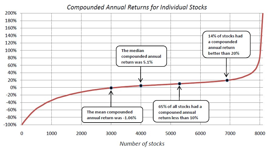
Isn’t this what one would expect?
All you can lose in a stock is your initial investment but a successful company can grow in size by several orders of magnitude, so you would expect to have the positive returns skewed significantly to the right. This is similar to income and wealth where the banks etc. generally won’t let you have massive negative wealth and income but a few successful people can own a substantial percentage of the country or world’s wealth and income (as they do now).
Similarly, success rate of new small businesses is generally dismal with most failing within a few months or years. However, the successful ones can turn into an Apple or Wal-Mart. We have a small shopping center near us where several of the store fronts turn over every few months but a handful of tenants have been there for a couple of decades and have grown into some of those extra spaces.
The opportunity for almost unlimited gains in a stock is why you want to be very careful about going short as it is the primary way in which you can have almost unlimited losses in the stock market as this person just found out: This guy went to bed thinking he had an account value of $37k and woke up to discover that he was now in the hole $107k and he is asking the general public to cover his losses http://www.marketwatch.com/story/help-my-short-position-got-crushed-and-now-i-owe-e-trade-10644556-2015-11-19?link=MW_home_latest_news
I am an insider lucky… er… a… talented enough for my business to be The One. Why do I leave a lot on the table for the other guy? The Wall Street bank with their fixed IPO rates is going to leave money on the table for me?
Buy the index. Hold it. Use an ETF to absorb the cap gain tax. Do the same with bonds. 60/40 ish. Rebalance. Worked
Might not mind being a median investor but sure as hell wouldn’t want to be ‘average’ (mean).
Gheez talk about inequality! The rich just keep getting richer why can’t we just tax down the curve?
The data goes back to 1983. There are more interesting charts at the link – 64% of stocks underperform the Russell 3000.
Would a broad-based index fund be closer to the mean or median “average”, and why?
I would expect an unweighted index to be closer to the median, but can think of several reasons why that might not be the case.
Also, the use of an annual field of view kinda alters the perception a bit. Some companies have VERY long business cycles, and if the year in question is not one that has a lotta revenue coming in the door, that stock is gonna look pretty bad, even if the investment time horizon is longer (say, an IRA). I suppose this chart could have been derived by distilling stock performances for every year, in a large chunk of time, in which case this might well represent a cross-section of a Monte Carlo analysis of a stock market. (i think).
The curves are too smooth and pretty. I read went to the original and was not able to find their methodology, apart from the time-period. Such gloriously symmetrical curves only appear in geometry textbooks and graphing software.
The story they tell is lovely. It may even be accurate. But it confirms your index-loving priors, Barry. As “rd” says above, “It’s what you would expect.” So I’m suspicious that the data have been–not doctored, but–smoothed and sculpted. The natural world is lumpy and bumpy.
With apologies to Groucho Marx, I’d never believe a graph that confirms what I already believe.
I think I want a list of the 14% of stocks with compounded 20% + returns, but I don’t know the time period.