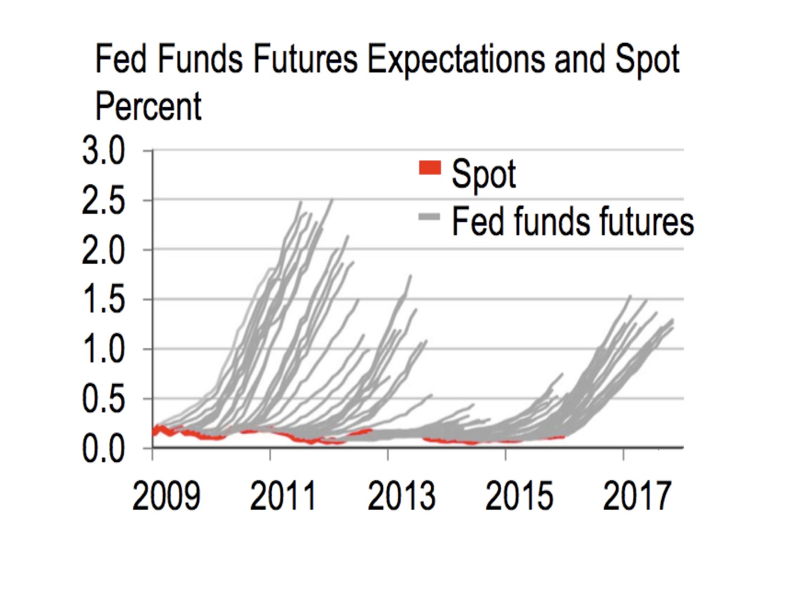
It should be easy to at least get the direction of interest rate changes correct, most of the time. Instead as we see in the chart here, professional money managers always get this wrong (and truth be told this pattern has been going on for many cycles). The problem is just as bad when it comes to predicting stock price changes for the following year. Nevermind that the brash financial pundits have assured you that now is a great time to rotate into stocks, given that we are both in the middle of a “Santa Claus rally” and within a year ending in “5”! Nothing could be more cockamamie. Next week we have the highly-anticipated, Federal Open Market Committee meeting where there is a chance that the discount rate will be hiked for the first time since before the recent financial crisis. While both risks in stock and bond markets are again smouldering in advance (note we correctly forewarned exactly 2 years ago today in the New York Times that we’d suddenly have a few ~3% or more daily drops in the stock market during 2014-2015), we focus our attention here on the knottier and more pertinent idea of the dispersion about interest rates expected for 2016. In other words, what should this probability distribution of outcomes or errors best look like?
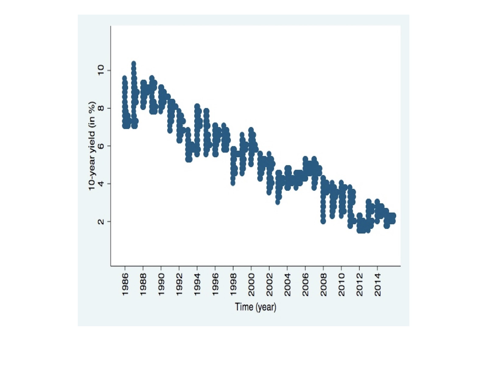
We will combine the best concepts from modern interest rate modeling, macroeconometrics, and probability theory. To start, see the blue color graphical representation below of the 10-year treasury bond yield distributions, over the past 30 years (1986 through today). We notice an astonishingly large and complex shape to the rate disturbances over the course of a year, making the job of borrowers, business planners, and traders, far more interesting.
We know from modern interest rate modeling (used for various purposes through finance) that these bond rates can follow either an equilibrium rate, or an arbitrage-free rate class of models (the main difference being that the former assumes that the inputs are reliable). Both of these model types can then be further split into risk-neutral, and a realistic class of models (the main difference being the former assumes the current pricing can be used). The idea (in theory) is that this volume of bond math work focuses on capturing the guidance of bond rates, to their more natural level. However it does little to describe the enormous amount and differing quality of the error dispersions about any progressing path.
And the typical macroeconometric model tries to take on some of these opposing considerations into account, on the front of pricing and parameter inputs. It would incorporate too much autocorrelation within important market variables, which we know from probability theory (combined with personal market observations over decades) can be erroneous. We’ll also provide below an exploration of exponential weighting of past empirical distributions (as opposed to the simple aggregation that most analysts already use).
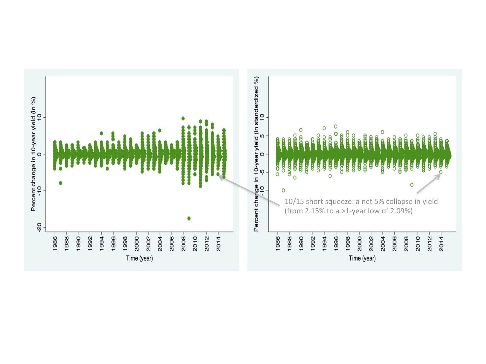
We’ll show the relevant de-trended, daily yield changes across time, for the blue raw chart above. You can see this in the green color chart below. One can see the breach of modern interest rate modeling formulas that target volatility proportional to the level of the rate, yet we see on this left hand chart that there is a theoretically insurmountable violent pick-up in volatility only from 2008 onwards! And we have a second version on the right, which trains the eye to better focus on the shape of the distributions, as opposed to the magnitudes of the extreme gyrations. We do this by rescaling the distributions across time so that they have an equal higher-order dispersion.
Now we can use these rate modeling changes as our historical data, from which we can peer into 2016. We use the current 10-year yield of 2.1%, unite it with the blue raw yield distributions further above, and then redraw below the new, red color interest rate distributions. The chart on the right, again, has been rescaled to our 30-year average (which -as we noted early in this article- the current 2015 volatility in bond yields are reasonably above average).
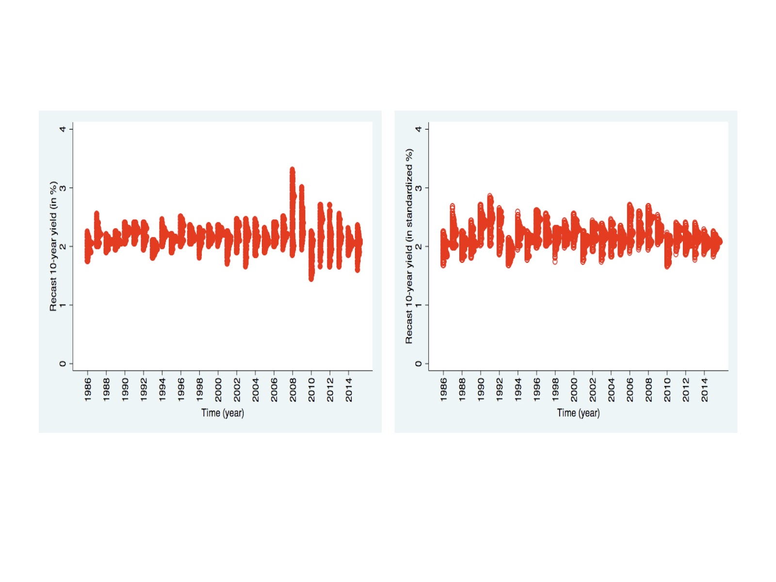
We can also see from this vast distance of time (e.g., in the green charts further above) what a legendary treasury market wreck occurred on October 15, 2014. But notice as well how this sorely magnanimous deviation no longer glares at us in the red charts immediately above?
Now to look into 2016, we can then combine our insights into the 3-year history of balanced and rescaled distributions of rate changes, and give a natural and more reliable probability distribution that better reflects what could happen at the end of 2016 (beyond any subtle, underlying trend ensued by a chaotic and random path.) The first distribution, on the gold color chart below on the left, we can think of as the error distribution given 100% weight still on the 2015 data.
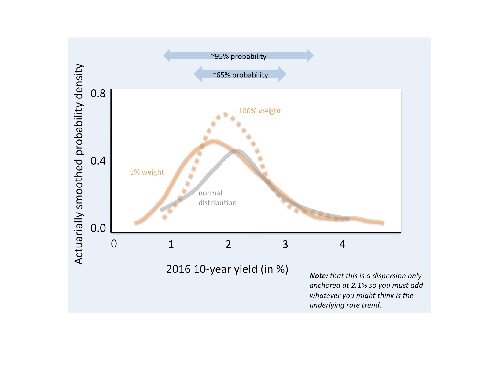
We can then show this (sticking with the same left chart immediately above), for the scenario where we provide a lower 50% weighting on the 2015 data, but then this would now accommodate a 25% [or 50% weighting of the (100%-50%) remaining] on the 2014 data, etc. One can see the weighting formulae through the example below, for the case where we assume a parameter estimate is 20%:
2015 weight = 20%
2014 weight = 20%*(100%-20%) = 16%
2013 weight = 20%*[100%-20%-20%*(100%-20%)] = 20%*[100%-20%-16%] = 10%
2012 weight = 20%*(100%-20%-16%-10%) = 6%
Where we can see relative to the 50% parameter estimate (and particularly the 100% parameter estimate), the probability weight becomes more naturally spread across past history.
As we have done previously, we look at the right hand chart above, for the 2016 dispersion likelihood accompanying the same averaging parameters, except for the scale-standardized distributions.
We notice in the charts that we can expect that once the bond volatility climaxes next year or beyond, that it should simmer down to levels more modest than what we had in 2015. Further we can shrewdly notice below, from the difference in the standardized distribution shapes, between the 100% and the 1% parameter weighting, that the 2016 bond rates can present a distribution with fatter tails (in both directions!) Similar to above, all of the distributions below have the same median and standard deviation.
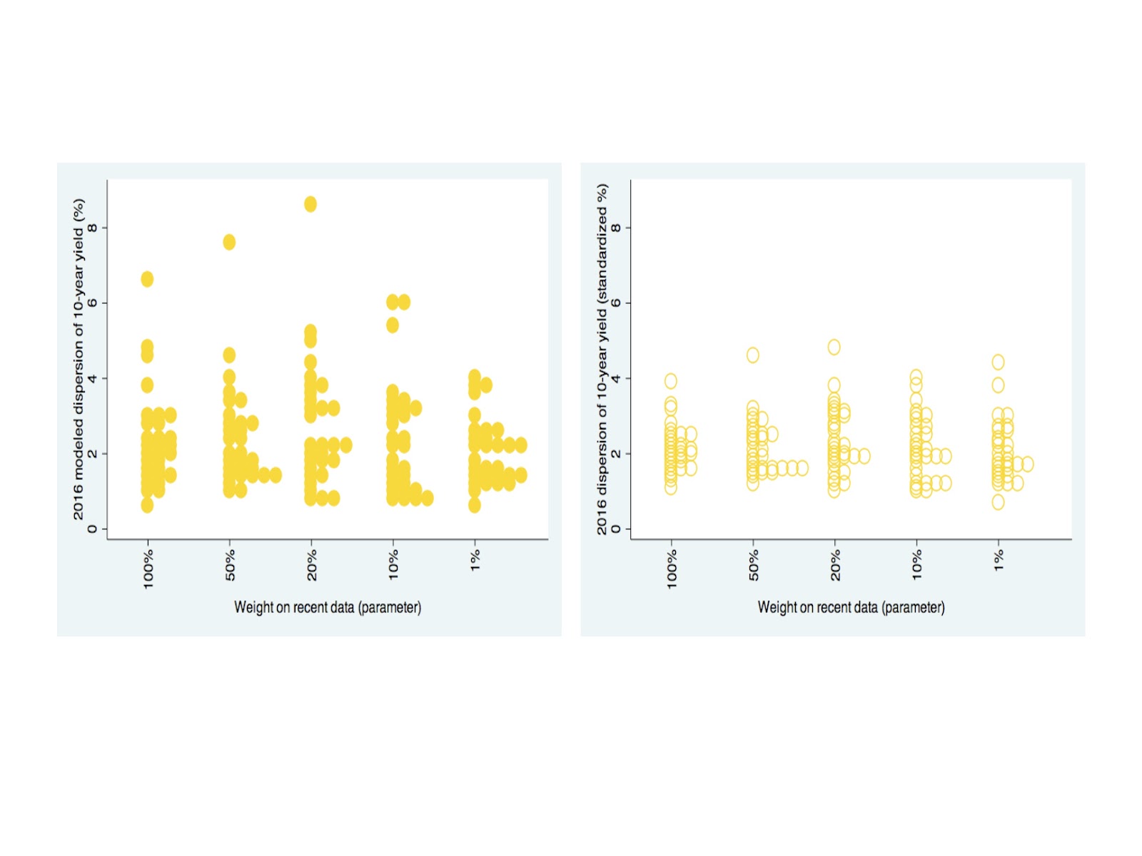
This implies that there is slightly greater probability room (maybe equally in both directions) to experience a ferocious surprise in the 2016 end-of-year rates. Again however, these engaging distinctions in the shape of next year’s distribution shouldn’t detract you from another important message here: that the lift-off in treasury rates –once it happens– should right away also be a significant consideration.
Source: Statistical Ideas


Backtesting doesn’t work.
If it did, the computer traders would be trilionaires.