
Labor Force Participation Rate: Men (Percent, Seasonally Adjusted)
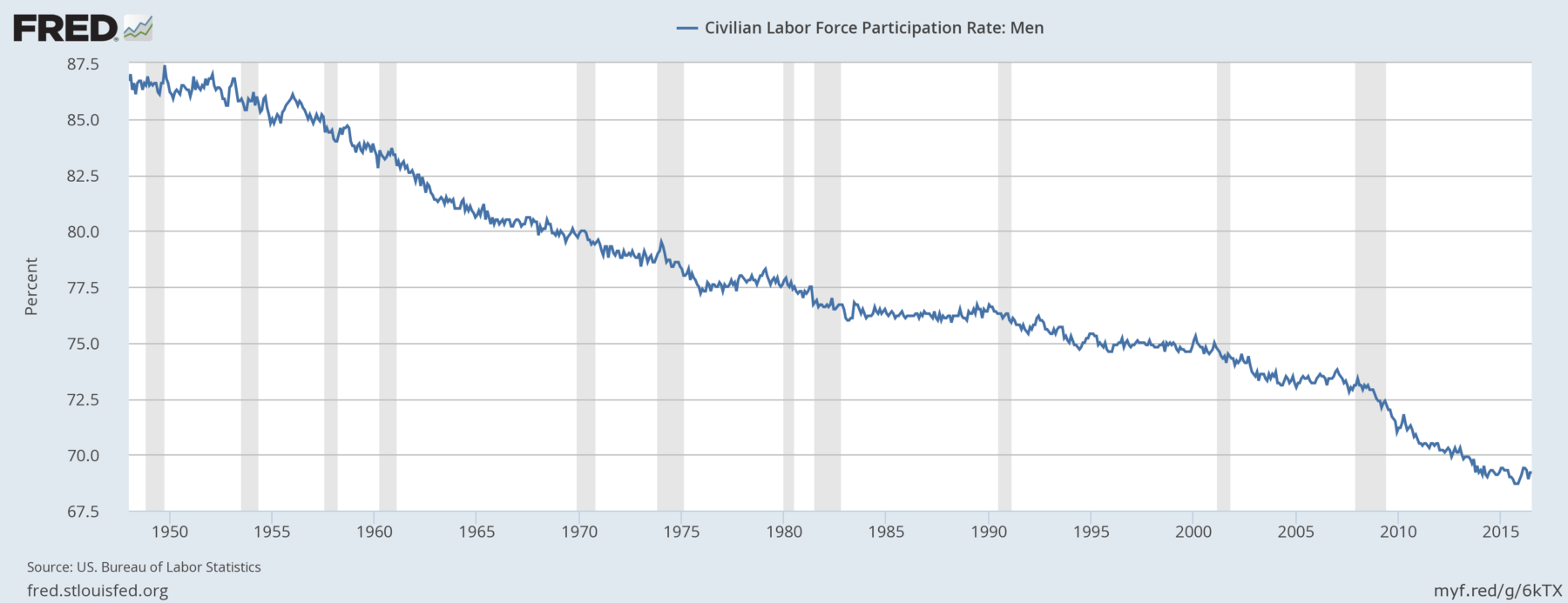
Source: Fred
A Job-Market Tale in Two Charts
Maybe we’re close to some kind of work force gender equilibrium.
Bloomberg, September 1, 2016
Many observers will be focused on tomorrow’s jobs numbers as they wonder aloud if, when or even how much the Federal Reserve will raise interest rates. My own best guess is that short of another blowout number — 250,000 or more jobs added — the Fed will likely wait until December, if only to avoid any appearance of trying to tilt the election.
Tomorrow, I will be looking specifically at the labor force participation rate. It has seen some modest recovery from the lows of last year in recent months, and that could be a sign of the end of a secular cycle. Or it could just be ordinary noise in a volatile data series.
Over the years, I have written about an interesting aspect of the employment data: what I call NILF (I’m typing carefully here), or not in the labor force. It describes those workers who have dropped out of the labor pool.
The impact of people leaving the labor force tends to lower the official unemployment rate. When the denominator is smaller and the numerator remains unchanged, all else being equal, the outcome is a higher percentage of employed and a lower percentage of unemployed.
This isn’t necessarily a sign of economic health. No wonder certain politicians love to focus on this data point as proof that the U.S. is on the wrong track.
Why leave the labor force? It’s more than mere economics — demographics play a large role, along with wages, technology and globalization. It could be that the type of work you do no longer exists, and it isn’t worth taking a much lower-paying job. Much of the time, people leave the labor force for things like going back to school, having kids, retiring or going on disability. And, of course, mortality is constantly taking people out of the labor market.
But there is an unusual confluence of forces at this particular moment that makes tomorrow’s nonfarm payroll number more interesting than usual. So let’s take a closer look at the number I find most interesting.
The labor force participation rate since World War II tells a muddled tale. For sure, cultural changes are reflected in its rise and fall. However, the total rate obscures the full story. To unpack some of the details, we must break the rate into two parts: men and women in the workforce.
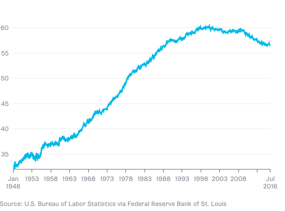
A good conceptual starting point is Rosie the Riveter: Women went to work in great numbers during World War II, including in traditional male jobs such as heavy manufacturing. Perhaps that helped change views on women in the workplace. But it wasn’t until the 1960s that women began entering the work force in great enough numbers to raise their participation rate. You can surely credit the rise of feminism and improved contraception as factors, but there are no doubt many others.
As the chart below shows, participation rates for women in the early 1950s were less than 35 percent. But beginning in the mid-1950s, it climbed, passing 40 percent by 1966, 50 percent by 1978 and more than 55 percent by 1986. Participation rates for women plateaued at 60 percent in the late 1990s and since fallen slightly to a little less than 57 percent.
Men’s participation rate tells a very different story, as you can see from the next chart. It is noteworthy that since it peaked in 1949 at 87 percent, the labor force participation rate for men has been falling ever since. Keep this chart in mind when you hear pundits talk about angry male voters. The forces behind this have been building for a long, long time.
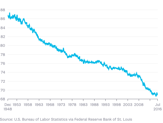
There have been five notable periods when the rate of men leaving the labor force has accelerated. Each time was marked by a significant recession. The rate today for men hovers at about 69 percent, a 70-year low, and only some 12 percentage points higher than women.
Which leads to one observation: Maybe we’re getting closer to some kind of economic and social parity between the sexes. That range, or maybe somewhere in the middle, reflects a form of workplace gender balance. Is this narrowing difference reaching its end point? Does the male-female participation gap reflect anything other than women leaving the work force to have children? I have not seen hard data on that, but perhaps fresh numbers might help us determine what has driven the trends of gender participation rates.
One final observation: It looks like women’s participation rates have found equilibrium. Let’s hope that the same can be said of men.
________
1. A quick primer on how the participation rate is calculated: Unemployment is a percentage, meaning it is actually a fraction. Total number of people in the labor pool divided by total number of employed equals employment rate. Subtract the percent employed from 100 to get the unemployment rate.
Originally: A Job-Market Tale in Two Charts

What's been said:
Discussions found on the web: