There was a surprising amount of pushback to yesterday’s column on the labor force participation rate. Some of the questions raised by emailers and Tweeters were interesting enough that I thought it might be worthy of a public response. (Note in today’s August non farm payroll report the labor force participation rate remained unchanged at 62.8 percent. Thus, we have no new evidence one way or another as to whether an end to the secular trend of falling participation rate is occurring).
I have been discussing NILF as an aspect of the labor pool for more than a decade (see this, this, this, this, this, this, this, this, this, and this). Whenever I try to cover a meaty subject in 600-700 words, something must be edited out; it is not my intention to make my Bloomberg columns the definitive word on the subject. Rather, I try to raise interesting points you may have not seen or thought of. Perhaps its best understood to place this column in context of that long continuum of prior columns, posts, tweets, etc.
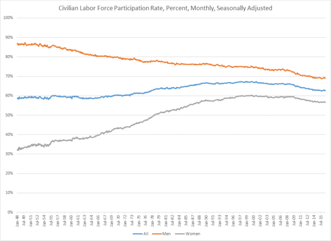
In the case of Labor Force Participation Rate is a Tale of Two Genders, my main thesis was that huge societal forces have been driving two very different trends in those who have been entering or leaving the labor pool. Since the 1960s, the number of women entering the work force has skyrocketed, nearly doubling over half a century. Men, on the other hand, saw a decrease of over a fifth during that same time period.
These are astonishing numbers.
Now, about that pushback: Some of you raised an issue with my footnoted explanatory of how LFPR is calculated:
A quick primer on how the participation rate is calculated: Unemployment is a percentage, meaning it is actually a fraction. Total number of people in the labor pool divided by total number of employed equals employment rate. Subtract the percent employed from 100 to get the unemployment rate.
As a fraction, it looks something like this:
The BLS site explains the basic concept of Labor Force Participation in a fact sheet, and to be blunt, I don’t see much difference between the two explanations other than stylistically (as opposed to factually).
Next, there was some thoughtful pushback as to the two charts used as misleading:
“It was potentially misleading because he showed it on two different graphs with different scales, omitted the origin, etc. All my pet peeves for perception manipulation of data. So I got the data from FRED and graphed it myself.”
Anytime two charts have different scales you must be on guard for data manipulation, si this is a valid concern.
However, I reached a different conclusion than that assessment for several reasons: First, I thought that the “U.S. Bureau of Labor Statistics via Federal Reserve Bank of St. Louis” sourcing on each chart was sufficient for anyone else to find the data if they wanted; this was not a general interest column, it was a wonky dissection of an aspect of NFP. Most sophisticated readers interested in this sort of economic data know exactly what FRED is.
I tweeted the two links yesterday; however, it might have been helpful to include the links to the original data sources as a reference in the column under each chart.
That sourcing is:
Civilian Labor Force Participation Rate: Men (LNS11300001)
Civilian Labor Force Participation Rate: Women (LNS11300002)
Perhaps I can prevail upon the Bloomberg style guide to include those links in future usage of FRED data.
Next, the complaint was that the interactive charts posted used similar – but not identical – scales. I thought the scales were similar enough — about 30% and 20% — not to matter. I eyeballed the charts prepublication, and they did not leap out as misleading to me.
However, the suggestion was made to use a chart like this:
I like this chart, but I thought the two we used told the tale much better.
If this was a News article, perhaps identical scales and an all in one chart would be preferred. But it’s an Opinion and Commentary piece, and I thought the two distinct charts told the story better than the single chart.
I have warned repeatedly of the dangers narratives present to investors, but this was not that sort of stock/market column where that bias impacted a final investment decision.1
Finally, as long as I am responding to emailers, I might as well answer the person who wrote “Way to go out on a limb!!!!!!” in response to my acknowledging that recent data might not mean anything (e.g., “Or it could just be ordinary noise in a volatile data series”)
Recognizing that a single noisy data point may not be all that is simply good analysis of a data series. Recall the weak NFP in May or the poor GDP in Q1. Those who made trade decisions based on these single data points likely made expensive mistakes.
My response is that I simply prefer not to make stuff up – especially the usual forecasts, expectations and “soft” predictions (“this or that could happen”).
It is a quirk of human psychology that people prefer to be told lies – they want confident and specific forecasts, not honest accurate ones that acknowledge the unknown and unknowable future. I’ve written enough columns about Cognitive Foibles and Human Psychology that I have learned people vastly prefer a false certainty from pseudo-gurus then honest admission that we simply do not know what the future holds.
That’s a wetware problem I seek to avoid. To those readers who wants to play the future forecasting or market prediction game, it is respectfully suggested you might look elsewhere for that sort of stuff. I find it worse than useless, it is truly misleading.
___________________


What's been said:
Discussions found on the web: